Open Source Survival Analysis¶

(Framingham à la Dilettante)¶

For those unfamiliar with survival analysis, there is a cursory introduction in Mini Appendix D, at the end of this notebook.

CC BY-NC-SA 4.0

This notebook is published under the Creative Commons CC BY-NC-SA 4.0 license by mathias.elsner.

You may share and adapt this material for non-commercial purposes under the same license, giving attribution.

Of course, this paragraph is supplied tongue-in-cheek, as there will be no reason at all for someone to re-use this stuff.

What's on this Webpage?¶

This is a walk-through of performing statistical time-to-event analysis, exclusively employing open source tools. My background is that of clinician, not statistician, thus I have chosen a historical medical dataset to showcase the methods.

Why Framingham?¶

The Framingham Heart Study, inaugurated in 1948, arguably is the single most famous observational study in the history of medicine.

The study was seminal for the concept of cardiovascular risk factors, which seems so self-evident three generations later. The very first publication, in 1957, covered 4 years of follow-up, which was later remarkably extended to 24 years. The importance of the Framingham Heart Study and it's multiple extensions and spinoffs may be appreciated by the fact that, over time, it gave rise to more than 3000 original publications in peer-reviewed journals...

Further background information can be found on Wikipedia or on the Framingham Study's homepage. You could even watch a twelve minute YouTube video on the 70th anniversary of the study by clicking the thumbnail:

Framingham 70 years

Why Dilettante?¶

A dilettante (Italian dilettare from Latin delectare "to rejoice", "to delight") is a lover of an art or science who deals with it without formal education, and not professionally. As an amateur or layman, he does a thing for its own sake, that is, out of interest, pleasure or passion. That's me with regard to programming languages and to statistics ;-)

Why Python with Lifelines in JupyterLab?¶

I do not have access to commercial statistics software like SPSS, MedCalc or SAS. I neither have experience in R programming nor MATLAB scripting. Python rules! because of versatility, readability and community.

I previously performed my fledgling data analyses in Python through scripts written with conventional IDEs or text editors, because that's where I came from. Reminiscence:

A fleeting stream of text and numeric output (from statistical test procedures etc.) would cascade through the terminal window, while layered plots cluttered my desktop. The more intricate an analysis got, the more changes accumulated, the more difficult it became to keep track of everything. Versioning and troubleshooting were veritable PITAs...

Jupyter Notebooks seem such a logical choice in hindsight. Yet, I am very late to the party.

Lifelines is a comprehensive Python library for survival analysis, that neatly integrates with notebooks and comes with a rather user-friendly documentation. Some background information on lifelines may be found in this article by the delevoper. Alternatives for survival analysis in Python might be scikit-survival, pysurvival or statsmodels. The latter library is very powerful and extensive. It is quite useful for various statistical methods. However, to my mind, it is less intuitive to work with on survival analysis, which may be a matter of documentation rather than implementation.


Study Data¶

Source¶

The U.S. National Heart, Lung and Blood Institute provides a sanitized "teaching dataset" of the original Framingham Heart Study. On registration, I submitted a data request, which kindly was fulfilled:

NIH

Dataset¶

The dataset is a subset of the study data collected from 1948 onwards and includes laboratory, clinic, questionnaire, and adjudicated event data on 4,434 participants. Data was collected during three examination periods, approximately 6 years apart, from roughly 1956 to 1968. Each participant was followed for a total of 24 years.

Caveat¶

From the NIH data documentation:

"Although the enclosed dataset contains Framingham data ‘as collected’ by Framingham investigators, specific methods were employed to ensure an anonymous dataset that protects patient confidentiality. Therefore, this dataset is inappropriate for publication purposes."

Acknowledged. See disclaimer.

Disclaimer¶

The aim of this notebook is not to gain new insights from scientific data that have already been thoroughly analyzed decades ago. We will simply use the venerable dataset as a generic example to play around with. We will neither aim at a full descriptive nor formal analysis of the data.

The Framingham study is merely a starting point to try out some basic statistics stuff. Furthermore, this document is not a proper HowTo, but rather a walkthrough.

Stop Blathering, Get Going!¶

Like in any other Python project, we will first import some useful libraries:

In [1]:
# Import general data manipulation libraries
import pandas as pd
import numpy as np
# Import IFrame inline display
from IPython.display import IFrame

Then we will import the full dataset, and have a first look at the structure:

In [2]:
# Import full CSV dataset 
survival_data = pd.read_csv("frmgham2_me_cohort-1.csv", sep=';')
print(survival_data)
       RANDID  SEX  TOTCHOL  AGE  SYSBP DIABP  CURSMOKE  CIGPDAY    BMI  \
0        2448    1    195.0   39    106    70         0      0.0  26,97   
1        6238    2    250.0   46    121    81         0      0.0  28,73   
2        9428    1    245.0   48  127,5    80         1     20.0  25,34   
3       10552    2    225.0   61    150    95         1     30.0  28,58   
4       11252    2    285.0   46    130    84         1     23.0   23,1   
...       ...  ...      ...  ...    ...   ...       ...      ...    ...   
4429  9990894    2    248.0   48    131    72         1     20.0     22   
4430  9993179    2    210.0   44  126,5    87         1     15.0  19,16   
4431  9995546    2    269.0   52  133,5    83         0      0.0  21,47   
4432  9998212    1    185.0   40    141    98         0      0.0   25,6   
4433  9999312    2    196.0   39    133    86         1     30.0  20,91   

      DIABETES  ...  CVD  HYPERTEN  TIMEAP  TIMEMI  TIMEMIFC  TIMECHD  \
0            0  ...    1         0    8766    6438      6438     6438   
1            0  ...    0         0    8766    8766      8766     8766   
2            0  ...    0         0    8766    8766      8766     8766   
3            0  ...    1         1    2956    2956      2956     2956   
4            0  ...    0         1    8766    8766      8766     8766   
...        ...  ...  ...       ...     ...     ...       ...      ...   
4429         0  ...    0         1    6433    6433      6433     6433   
4430         0  ...    0         1    6729    6729      6729     6729   
4431         0  ...    1         1    5939    8766      5209     5209   
4432         0  ...    0         1    8766    8766      8766     8766   
4433         0  ...    0         1    8766    8766      8766     8766   

      TIMESTRK  TIMECVD  TIMEDTH  TIMEHYP  
0         8766     6438     8766     8766  
1         8766     8766     8766     8766  
2         8766     8766     8766     8766  
3         2089     2089     2956        0  
4         8766     8766     8766     4285  
...        ...      ...      ...      ...  
4429      6433     6433     6433     2219  
4430      6729     6729     6729     4396  
4431      8766     5209     8766      735  
4432      8766     8766     8766        0  
4433      8766     8766     8766     4201  

[4434 rows x 39 columns]
For clarity, only a selection of rows and columns is displayed.

The entire table is best viewed in a dedicated spreadsheet program like Excel, Numbers or LibreOfficeCalc. For copyright and licensing reasons, I may not provide a download link to the full dataset that was supplied to me by NIH/NHLBI.

To get a better idea of the available variables, you could have a look at the embedded data reference document from NIH in the IFrame window below:

In [3]:
IFrame("documents/FraminghamDataDocumentation.pdf", width=750, height=400)
Out[3]:

On mobile devices, PDF documents embedded in IFrames are not properly displayed. Most of the time, only the first page is rendered. If you encounter problems with scrolling through the document, you may open the Framingham Data Documentation in a new browser window by clicking the blue link in this textbox.


Clinical Endpoints¶

The Framingham Heart Study collected time-dependent event data for a number of clinical endpoints, amongst others, stroke, hospitalized myocardial infarction and combined "cardiovascular disease". Furthermore, some quite soft and subjective endpoints like "angina pectoris" were included in the dataset.

We have to bear in mind that, in the era of the study's inception, and during the initial cohort's follow-up, diagnostic tests and criteria were markedly different from today:

There were no Troponin tests, nor even CK laboratory tests, which became commercially available in the 1960ies. Echocardiography still was in it's infancy. Computed tomography (CT) scanning and coronary angiography did not enter the stage of medicine until the 1970ies, whereas Magnetic Resonance Imaging (MRI) began to become clinically useful in the 1980ies.

Mortality rules!¶

We will restrict most of our our analyses to the clinical endpoint of mortality, that is death from any cause.

The reasons for this are:

  1. Mortality is relevant.
  2. Mortality is unambiguous.
  3. All cause mortality definition remains unchanged over time.

Survival Analysis in Python¶

Let's import the first tool from the lifelines library. We will use some more methods from there as we go along.

In [4]:
# Import Kaplan-Meier survival method
from lifelines import KaplanMeierFitter
kmf = KaplanMeierFitter()

Let's prepare the timeline and outcome variables for our survival analysis:

In [5]:
# Choose time variable from full dataset
T = survival_data["TIMEDTH"]/365
# Choose event variable from full dataset
E = survival_data["DEATH"]

Plotting library¶

Professional grade graphs can be generated with the matplotlib library.

In [6]:
# Import plotting library
from matplotlib import pyplot as plt
import matplotlib.ticker as mtick

Displaying Graphs in Jupyter Notebook¶

Executed from within a standard Python environment, each figure would normally be displayed in a separate window supplied by the graphics backend and the computer's operating system. In order to display the figures within our Jupyter notebook, we will specify one of IPython's so-called magic commands (these special commands are preceded by a '%').

In [7]:
%matplotlib inline

Temporal Distribution of Overall Mortality Events¶

To get a first idea of the temporal distribution of our event data, we will plot a simple histogram.

In [8]:
# Define graph size
plt.figure(figsize=(10,5))
# Define plot
ax = plt.subplot(111)
# Additional markers
plt.ylabel("Number of Fatalities")
plt.xlabel("(Years)")
# Additional Infos
plt.title("Framingham-Study (1948 ff.): Mortality Events Over Time", color = "#4C9900")
plt.text(18,5, 'mathias.elsner: CC BY-NC-SA', fontsize = 7, color = 'grey', style = 'italic')
# Plot histogram
plt.hist(T, bins = 24, range = (0,24), histtype='step') 
Out[8]:
(array([ 31.,  28.,  30.,  41.,  46.,  53.,  49.,  46.,  48.,  57.,  65.,
         70.,  60.,  75.,  78.,  83.,  82.,  81.,  72.,  90., 107.,  82.,
         85.,  91.]),
 array([ 0.,  1.,  2.,  3.,  4.,  5.,  6.,  7.,  8.,  9., 10., 11., 12.,
        13., 14., 15., 16., 17., 18., 19., 20., 21., 22., 23., 24.]),
 [<matplotlib.patches.Polygon at 0x12f7e0790>])

Like most survival data, ours is not normally distributed, but skewed.

Kaplan Meier Survival Curve¶

We will then model a survival curve for our entire study population.

In [9]:
# Define graph size
plt.figure(figsize=(7,6))
# Define plot
ax = plt.subplot(111)
# Set percent formatter in order to display percent instead of float on y-axis
ax.yaxis.set_major_formatter(mtick.PercentFormatter(1.0, None,'%'))
# Fit and plot model
kmf.fit(T, event_observed=E, label='surviving')
kmf.plot_survival_function(ax=ax)
plt.grid(visible=True, which='both', axis='both', color='#C0C0C0', linestyle='-', linewidth=0.25)
# Additional Infos
plt.text(0, 0.65, 'mathias.elsner: CC BY-NC-SA', fontsize = 7, color = 'grey', style = 'italic')
plt.xlabel("(Years)")
plt.title("Framingham-Study (1948 ff.): Overall Cohort Survival", color = "#4C9900")
Out[9]:
Text(0.5, 1.0, 'Framingham-Study (1948 ff.): Overall Cohort Survival')

Exploring Covariates¶

We will have a look at the influence of several 'covariates' ('predictor variables', 'independent variables') on survival.

First Example: Diabetes mellitus¶

Among the 4433 participants, 8.6% of men and 7.1% of women were diagnosed with diabetes mellitus, either at baseline, or during follow-up. Presence of Diabetes was defined by being treated as such, or by a casual glucose level of 200 mg/dl or more.

Let's plot Kaplan-Meier survival curves of diabetic and nondiabetic subjects:

In [10]:
# Define graph size
plt.figure(figsize=(7,6))
# Define plot
ax = plt.subplot(111)
# Set percent formatter in order to display percent instead of float on y-axis
ax.yaxis.set_major_formatter(mtick.PercentFormatter(1.0, None,'%'))
# Iterate discriminator for diabetes status and plot respective survival curves
value_range = [0, 1]
for value in value_range:
    disc = (survival_data["DIABETES"] == value)
    kmf.fit(T[disc], event_observed=E[disc], label=value)
    kmf.plot_survival_function(ax=ax)
# Add ticks, grid, title and labels
plt.tick_params(labeltop=False, labelright=True, right=True)
plt.xticks(np.arange(0, 25, step=1), fontsize = 10)  # Set label locations.
plt.grid(visible=True, which='both', axis='both', color='#C0C0C0', linestyle='-', linewidth=0.25)
plt.title("Framingham-Study (1948 ff.): Survival Condition Diabetes mellitus", color = "#4C9900")
plt.xlabel("(Years)")
# Additional Info: license
plt.text(0, 0.2, 'mathias.elsner: CC BY-NC-SA', fontsize = 7, color = 'grey', style = 'italic')
# Set layout to fill canvas
plt.tight_layout()

Wow! The striking survival penalty for diabetic subjects most propably reflects the limited treatment options available at that time, as well as the relevance of Diabetes as a cardiovascular risk factor.

Let's explore, whether major cardiovascular events show a similiar pattern, which would corroborate the above notion:

Effect of Diabetes on Cardiovascular Events¶

Although called survival analysis, clinical endpoints other than mortality can be analized in the same fashion. When employed for non-lethal endpoints, we use the term event free survival to denote the time-course of endpoint-events. Let's prepare some more variables...

In [11]:
# Choose time variables from full dataset
TM = survival_data["TIMEMIFC"]/365
TS = survival_data["TIMESTRK"]/365
# Choose event variables from full dataset
EM = survival_data["MI_FCHD"]
ES = survival_data["STROKE"]

...and plot their eventfree survival curves:

In [12]:
# Define plot
fig, (ax1, ax2) = plt.subplots(1, 2, sharey=True, figsize=(9,6))
fig.suptitle("Event-Free Survival of Diabetic vs. Nondiabetic Subjects")

# Subplot 1:
# Set percent formatter in order to display percent instead of float on y-axis
ax1.yaxis.set_major_formatter(mtick.PercentFormatter(1.0, None,'%'))
# Iterate discriminator for diabetes status and plot respective survival curves
value_range = [0, 1]
for value in value_range:
    disc = (survival_data["DIABETES"] == value)
    kmf.fit(TM[disc], event_observed=EM[disc], label=value)
    kmf.plot_survival_function(ax=ax1)
# Add ticks, grid, title and labels
ax1.tick_params(labeltop=False, labelright=False, right=False)
ax1.set_title("Myocardial Infarction", color = "#4C9900")
ax1.set(xlabel='(Years)')
# Set layout to fill canvas
plt.tight_layout()

# Subplot 2:
# Set percent formatter in order to display percent instead of float on y-axis
ax2.yaxis.set_major_formatter(mtick.PercentFormatter(1.0, None,'%'))
# Iterate discriminator for diabetes status and plot respective survival curves
value_range = [0, 1]
for value in value_range:
    disc = (survival_data["DIABETES"] == value)
    kmf.fit(TS[disc], event_observed=ES[disc], label=value)
    kmf.plot_survival_function(ax=ax2)
# Add ticks, grid, title and labels
ax2.tick_params(labeltop=False, labelright=True, right=True)
ax2.set_title("Stroke", color = "#4C9900")
ax2.set(xlabel='(Years)')
# Additional Info: license
plt.text(8, 0.35, 'mathias.elsner: CC BY-NC-SA', fontsize = 7, color = 'grey', style = 'italic')
# Set layout to fill canvas
plt.tight_layout()

It seems quite plausible from our data, that the dire mortality outcome of diabetic subjects is related to cardiovascular events, which are the number one driver of mortality in the general population.

Since the pathophysiologic mechanisms and causal relationships between diabetes, cardiovascular disease and mortality have been extensively researched by our times, we will not explore this issue further.

We will, instead, turn our naïve attention to a risk factor, that is not amenable to medical therapy...

Educational Status: The Silent Killer?¶

In the Framingham Study, educational status was stratified by four layers:

  1. 0-11 years (Elementary, Primary or Middle School)
  2. High School Diploma, GED
  3. Some College, Vocational School
  4. College (BS, BA) degree or more

So, turning back to all cause mortality, what is the influence of education? Let's plot:

In [13]:
# Define Figure
plt.figure(figsize=(8,7))
# Define survival plot
ax = plt.subplot(111)
# Set percent formatter in order to display percent instead of float
ax.yaxis.set_major_formatter(mtick.PercentFormatter(1.0, None,'%'))
# Iterate discriminator
value_range = [1, 2, 3, 4]
for value in value_range:
    disc = (survival_data["educ"] == value)
    kmf.fit(T[disc], event_observed=E[disc], label=value)
    kmf.plot_survival_function(ax=ax)
# Add ticks, grid, title and labels
plt.tick_params(labeltop=False, labelright=True, right=True)
plt.xticks(np.arange(0, 25, step=1), fontsize = 10)  # Set label locations.
plt.grid(visible=True, which='both', axis='both', color='#C0C0C0', linestyle='-', linewidth=0.25)
plt.title("Framingham Study (1948 ff.): Survival Condition Educational Status", color = "#4C9900")
plt.xlabel("(Years)")
# Additional Info: license
plt.text(0, 0.55, 'mathias.elsner: CC BY-NC-SA', fontsize = 7, color = 'grey', style = 'italic')
# Additional Info: Discriminator legend
plt.text(12, 1.00, '1: Elementary / Primary / Middle School', fontsize = 9, color = 'grey', style = 'normal', weight = 'normal')    
plt.text(12, 0.99, '2: High School Diploma', fontsize = 9, color = 'grey', style = 'normal', weight = 'normal')
plt.text(12, 0.98, '3: Undergraduate / Vocational School', fontsize = 9, color = 'grey', style = 'normal', weight = 'normal')
plt.text(12, 0.97, '4: College (BS, BA) degree or more', fontsize = 9, color = 'grey', style = 'normal', weight = 'normal')
# Set layout
plt.tight_layout()

We see a striking pattern, with the lack of higher education conferring a major survival penalty!

Considering confidence intervals, the survival data for all levels of higher education seem neatly superimposed.

What about post hoc grouping for clarity?¶

It is tempting to combine the three higher education groups post hoc into a single, larger group for clarity and robustness, potentially narrowing confidence intervals.

However, when planning the study, we might very well have been unaware of where to expect the discrimination, if any. Thus the prespecified analysis (see below) would most propably have consisted of comparing all four goups with each other, respectively.

Post hoc analyses (i.e. analyses performed in knowledge of study data) may only be used for explorative purposes and hypothesis generation. They should be used neither for formal statistical testing, nor deduction of clinical implications. Having said that, we will take the liberty to perform them later on, anyway.

What would be a viable prespecified statistical analysis?¶

By convention, and because it results in a reasonable compromise between alpha and beta errors, we generally test statistical hypotheses against a propability of alpha P < 0.05.

We will cover the question of which test statistics might be appropriate, in a seperate paragraph. Let's first have a look at whom to test against whom:

Testing for differences among the four educational groups could be performed by six seperate groupwise tests

(i.e. 1-2, 1-3, 1-4, 2-3, 2-4, 3-4)

Since multiple testing should be controlled for statistically, in order to limit the risk of spurious false positive findings, we shall not perform all six tests against an alpha of 0.05.

There are numerous options for controlling multiplicity. However, within the scope of this humble notebook, we will only discuss the time-honoured, albeit very conservative Bonferroni's method. It is rather straightforeward:

When the studywise error shall be alpha = 0.05, for k comparisons, let alpha(k) = alpha / k.

In plaintext: For six comparisons each, we shall test against P < 0.0083 (0.05 / 6).

Proceeding thus, we retain the prespecified alpha for the study as a whole. However, we sharpen the alpha for the individual groupwise comparisons, reducing the overall power of our study to statistically confirm a relevant real world difference between groups.

As an alternative, several omnibus extensions for standard tests have been proposed, that may handle multiple group survival comparisons. However, these may sometimes be difficult to interpret, and may not be available in basic statistics packages. Anyway, they are beyond the scope of this document.

What next?¶

Following the above exposition on what we should do, we will do something different, of course ;-)

We will proceed in a post hoc fashion, by combining groups 2-4 into a single group of higher education. This will give us a dichotomous covariate "higher education yes/no".

The intent for this is not post hoc beautification of the results. The intent is to simplify the data structure, in order to reduce the complexity and bulk of statistical testing for the sake of didactic clarity. Furthermore, important general principles of data cleansing and statistical analysis will be easier to understand from the consolidated dataset.

Before we delve into data cleansing and statistical testing, however, we will display our consolidated data in one more graph.

Post hoc analysis: Higher Education (yes/no)¶

First, we will prepare our model and the dichotomous discriminator:

In [14]:
# Discriminator
kmf_lo = KaplanMeierFitter()
kmf_hi = KaplanMeierFitter()
lo_edu = (survival_data["educ"] == 1)
hi_edu = (survival_data["educ"] > 1)

Intro: At Risk Tables¶

When showing survival curves, one should always enclose so-called 'at risk tables', i.e. time series tabulations of the number of events, and the number of participants remaining at risk, respectively. This allows the reader to draw conclusions, amongst other things, on the robustness and reliability of the data on display.

Let's import the method needed for this:

In [15]:
# Import at risk counts for survival graphs
from lifelines.plotting import add_at_risk_counts

Now we can proceed to generate a slick graph:

In [16]:
# Define figure
plt.figure(figsize=(9,8))
# Define survival plot
ax = plt.subplot(111)
# Set percent formatter in order to display percent instead of float
ax.yaxis.set_major_formatter(mtick.PercentFormatter(1.0, None,'%'))
# Model data
kmf_lo.fit(T[lo_edu], event_observed=E[lo_edu], label="Elementary/Primary/Middle School")
kmf_lo.plot_survival_function(ax=ax)
kmf_hi.fit(T[hi_edu], event_observed=E[hi_edu], label="High School/Vocational/College (BS, BA or higher)")
kmf_hi.plot_survival_function(ax=ax)
# Add ticks, grid, title and labels
plt.tick_params(labeltop=False, labelright=True, right=True)
plt.xticks(np.arange(0, 25, step=1), fontsize = 10)  # Set label locations.
plt.grid(visible=True, which='both', axis='both', color='#C0C0C0', linestyle='-', linewidth=0.25)
#plt.minorticks_on()
plt.title("Framingham Study (1948 ff.): Survival Condition Higher Education", color = "#4C9900")
plt.xlabel("(Years)")
# Additional Info: license
plt.text(0, 0.55, 'mathias.elsner: CC BY-NC-SA', fontsize = 7, color = 'grey', style = 'italic')
# At risk table
add_at_risk_counts(kmf_lo, kmf_hi, ax=ax, fontsize = 6, color = 'grey')
# Set layout
plt.tight_layout()

Let's have a closer look at the at risk table:¶

  • "At Risk" and "Events" are rather self-explanatory.
  • In survival analysis, "Censored" may subsume several distinct entities:
  • Subjects withdrawing consent (withdrawing from the study)
  • Subjects lost to follow-up
  • Subjects without an event up to the end of the study (all remainig subjects are right-censored in the end)

It is quite unusual for a long-term study comprising of several thousand subjects to not experience any censoring along the way. We may speculate that people in the 1950ies did not dare to withdraw from an important official scientific study. The total lack of loss to follow-up may furthermore be explained by the constricted geography (all subjects were recruited from a single smallish town in Middlesex County, Massachusetts). The NIH data documentation explicitly states that "each[!] participant was followed for a total of 24 years", which is a remarkable feat.

Beware of Scales...¶

When large study populations encounter low event rates, two hypothetical survival curves may, for example, descend from 100 % to 98 % and 96 %, respectively. Plotting these in a graph on a y-axis scale of 95 - 100 %, the difference in survival, and the temporal behaviour is discerned easily.

However, the difference will appear heavily exaggerated to the human observer. Thus it should be part of reputable reporting, to supply a supplemental second plot, that shows the same survival curves on a full scale of 0-100% for studies with low attrition.

Since our survival curves drop to less than 60% and roughly 70%, respecively, this may not be such a big issue. For the sake of respectability, however, we will include both scales, side by side:

In [17]:
# Define figure
fig, (ax1, ax2) = plt.subplots(1, 2, sharey=False, figsize=(9,5))
fig.suptitle("Survival Curves to Scale")

# Subplot 1:
# Set percent formatter in order to display percent instead of float
ax1.yaxis.set_major_formatter(mtick.PercentFormatter(1.0, None,'%'))
ax1.tick_params(labeltop=False, labelright=True, right=True)
# Plot survival curves without confidence intervals (for clarity)
kmf_lo.plot_survival_function(ax=ax1, ci_show=False, label='lower')
kmf_hi.plot_survival_function(ax=ax1, ci_show=False, label='higher')
# Additional info
ax1.set_title("populated scale", color = "#4C9900")
ax1.set(xlabel='(Years)')
ax1.grid()
# Subplot 2:
# Set percent formatter in order to display percent instead of float
ax2.yaxis.set_major_formatter(mtick.PercentFormatter(1.0, None,'%'))
ax2.tick_params(labeltop=False, labelright=True, right=True)
# Plot survival curves without confidence intervals (for clarity)
kmf_lo.plot_survival_function(ax=ax2, ci_show=False, label='lower')
kmf_hi.plot_survival_function(ax=ax2, ci_show=False, label='higher')
# Set full scale for subplot 2; adjust top to grapically match subplot 2
ax2.set_ylim(bottom=0, top=1.048)
# Additional info
ax2.set_title("full scale", color = "#4C9900")
ax2.set(xlabel='(Years)')
ax2.grid()
# Additional Infos
plt.text(10,0.05, 'mathias.elsner: CC BY-NC-SA', fontsize = 7, color = 'grey', style = 'italic')
# Set layout
plt.tight_layout()

Now, what about some real statistics?¶

We will prepare an excerpt of our full dataset, for further analysis. This subset will be restricted to three variables:

  • DEATH (all cause mortality 0/1)
  • TIMEDTH (time from recruitment until event)
  • higher (higher education 0/1)

The dichotomous higher variable is derived by reclassification of the original educ variable like this:

{ 1 } → 0

{ 2, 3, 4 } → 1

Let's import the derived dataset and have a look:

In [18]:
# Import CSV dataset excerpt
survival_dicho = pd.read_csv("jup_surv_educ_dicho.csv", sep=';')
print(survival_dicho.dtypes)
print(survival_dicho)
TIMEDTH      int64
DEATH        int64
higher     float64
dtype: object
      TIMEDTH  DEATH  higher
0        8766      0     1.0
1        8766      0     1.0
2        8766      0     0.0
3        2956      1     1.0
4        8766      0     1.0
...       ...    ...     ...
4429     6433      1     1.0
4430     6729      1     0.0
4431     8766      0     1.0
4432     8766      0     1.0
4433     8766      0     1.0

[4434 rows x 3 columns]

At first glance, this looks fine to proceed. However...

Data Scrutinizing and Cleansing¶

Before performing formal analyses, we should have a closer look at the raw data. Amongst other things, we should:

  • Check for consistency of data types and "rubbish" characters in the table entries for all variables.

  • Clarify, whether there are any NaN entries for our variables and should decide, what to do about them.

WTF are NaN ?¶

NaN is short for 'Not a Number' and refers, most often, to empty cells in a dataset. Empty cells are likely present due to missing values. Since follow-up was extraordinarily comprehensive in the Framingham Study, there should be no missing values for clinical endpoints. However, not all information is present on all data items for all subjects.

Most statistical methods will not handle NaN natively, and will throw an error, if we feed them a dataframe containing NaN.

This is quite appropriate, as NaN should not be handled automatically. Important questions have to be clarified by the data scientist:

  • How large is the proportion of NaN for a given variable? If, for example, 70% of values are missing, we might refrain from using this variable as a covariate altogether. If the rate of NaN is quite low, very rudimentary data cleansing techniques might be sufficient.
  • Are NaN distributed randomly or systematically? If, for example, blood pressure data were missing predominantly from female subjects, our conclusions derived from a dataset may be skewed or outright invalid.

There are basically two distinct strategies for dealing with NaN:

  1. Exclude subjects with incomplete data from the analysis. This strategy also is called 'complete case analysis'. If, however, we exclude subjects with any missing data in any variable, we might end up with a critically diminished dataset. We will lose statistical power, and we may even lose overall validity.

  2. Impute missing values. Imputation is employed to "fill up" the missing values. There are intricate problems and even more intricate solutions to imputation. One of the main problems is that, in order to retain the overall properties of the dataset, it is not sufficient to replace NaNs with plausible content. It is mandatory to also retain distributional properties like variance. Simple imputation will introduce various amounts of bias into the dataset, and thus into the analysis and it's conclusions.

Simple imputation strategies (inadequate most of the time):

  • Replace missing values in a covariate with the mean, median or modal of existing data,
  • Replace missing values with a 'missing indicator category' for categorial variables,
  • Replace mising values by the last value carried foreward approach.

Complex imputation strategies (computationally intensive):

  • Multiple imputation involves replicating the original dataset multiple times, and in each replication replacing the missing values with plausible observations drawn from the posterior predictive distribution. This strategy presupposes that missingness is conditionally independent (so-called 'missing at random', or 'MAR' assumption). The multiple imputation procedure requires the user to model the distribution of each variable with missing values, in terms of the observed data. Multiple imputation is not a panacea for porous or corrupted datasets. It is furthermore complex to plan and to execute. There are several examples in the published literature, where flawed application of multiple imputation has led to data inconsistencies and erroneous conclusions.
Unless there is compelling reason, we best refrain from imputation, although, to be honest, it often cannot be eschewed in clinical studies. For important projects, involving a statistics consultant may be advisable in order to avoid misguided conclusions from inappropriate imputations.

There is an implementation of multiple imputation for Python, provided in the statsmodels module MICE (Multiple Imputation with Chained Equations). We hopefully will not need it for our dataset, lest things become a bit arduous.

What about NaN in our dataset?¶

  • Due to complete follow-up and lack of drop-outs, we should have complete data on our event variables DEATH and TIMEDTH.

  • However, there are empty cells in the original educ variable, and thus, by necessity, in our derived higher variable as can be seen in this cutout from the data table:

bla

Python's pandas library supplies two ways to check for NaN, either by counting data cells with content, or by boolean checking of each cell being NaN True or False (which can then be summed up).

In [19]:
survival_dicho.isna()
Out[19]:
TIMEDTH DEATH higher
0 False False False
1 False False False
2 False False False
3 False False False
4 False False False
... ... ... ...
4429 False False False
4430 False False False
4431 False False False
4432 False False False
4433 False False False

4434 rows × 3 columns

Unfortunate for demonstration purposes, but fortunate for our analysis, NaNs do not seem too prevalent, at least at first glance.

Let's count them:

In [20]:
survival_dicho.isna().sum()
Out[20]:
TIMEDTH      0
DEATH        0
higher     113
dtype: int64

Let's cross-check, including any valid datatype:

In [21]:
survival_dicho.count(axis=0, numeric_only=False)
Out[21]:
TIMEDTH    4434
DEATH      4434
higher     4321
dtype: int64

Yup! There are 113 empty cells, i.e. missing values for our dichotomous covariate of higher education.

This amounts to 2.5 % of our study subjects.

So, let's have a look, how mortality is distributed among the participants with NaN in educational status:

In [22]:
print(survival_dicho[survival_dicho.isna().any(axis=1)])
print(survival_dicho[survival_dicho.isna().any(axis=1)].value_counts(subset=['DEATH'], normalize=False))
print(survival_dicho[survival_dicho.isna().any(axis=1)].value_counts(subset=['DEATH'], normalize=True))
      TIMEDTH  DEATH  higher
34       6948      1     NaN
38       8766      0     NaN
74       8766      0     NaN
192      3888      1     NaN
213      8766      0     NaN
...       ...    ...     ...
4269     8766      0     NaN
4285     8766      0     NaN
4310     8766      0     NaN
4311     5581      1     NaN
4327     4788      1     NaN

[113 rows x 3 columns]
DEATH
0        72
1        41
dtype: int64
DEATH
0        0.637168
1        0.362832
dtype: float64

The 113 subjects for whom we have no information with regard to educational status exhibit a survival rate of 64 % which, going back to our Kaplan-Meier graph, lies somewhere inbetween that of subjects with, and that of subjects without higher education.

Sensitivity Analysis¶

Fortunately, our outcome data are complete. Missing data in covariates do not cause bias performing complete case analysis, if the reasons for the missing data are unrelated to the outcome. Since mortality over time for our 2.5% of missing data cases is equivalent to overall mortality in our cohort, it is rather unlikely, that our missing data will have a major impact on outcome. However, we have to make sure.

In order to assess, whether we will have to go down the thorny route of multiple imputation, or can get by with complete case analysis, we will analyze how sensitive our results would be in several hypothetical ultimate limit states for our missing data. We will consecutively:

  1. Fill all 113 empty cells with "0" (higher education: no)
  2. Fill all 113 empty cells with "1" (higher education: yes)
  1. Fill NaN for the 41 fatalities with "1", and for the 72 survivors with "0"
  2. Fill NaN for the 41 fatalities with "0", and for the 72 survivors with "1"
  1. Delete all 113 subjects with empty cells (complete cases dataset)

For our limit analysis, we will model survival on all four limit datasets in order to ascertain that, even in the presence of maximally nonrandom missingness, our conclusions may not be influenced substantially by the missing values in our dataset.

If our limit analysis implies, that we can safely drop subjects with missing values, we will proceed with the complete cases dataset for clinical analysis and will skip multiple imputation procedures.

Let's prepare the five datasets:

In [23]:
#(0) Original dataset
# Display counts of non-Nan, again (we have already done this in code section [19])
print(survival_dicho.count(axis=0, numeric_only=False))
# Check counts of DEATH vs higher in our original dataset
print(survival_dicho.value_counts(subset=['DEATH','higher'], normalize=False))
TIMEDTH    4434
DEATH      4434
higher     4321
dtype: int64
DEATH  higher
0      1.0       1770
       0.0       1042
1      0.0        780
       1.0        729
dtype: int64
In [24]:
#(1) Lower limit case for higher education
survival_limit_0 = survival_dicho.fillna(value=0)
# Check counts of non-NaN
print(survival_limit_0.count (axis=0))
# Check counts of DEATH vs higher in modified dataset
print(survival_limit_0.value_counts(subset=['DEATH','higher'], normalize=False))
TIMEDTH    4434
DEATH      4434
higher     4434
dtype: int64
DEATH  higher
0      1.0       1770
       0.0       1114
1      0.0        821
       1.0        729
dtype: int64
In [25]:
#(2) Upper limit case for higher education
survival_limit_1 = survival_dicho.fillna(value=1)
# Check counts of non-NaN
print(survival_limit_1.count(axis=0))
# Check counts of DEATH vs higher in modified dataset
print(survival_limit_1.value_counts(subset=['DEATH','higher'], normalize=False))
TIMEDTH    4434
DEATH      4434
higher     4434
dtype: int64
DEATH  higher
0      1.0       1842
       0.0       1042
1      0.0        780
       1.0        770
dtype: int64
In [26]:
#(3) Fill NaN for the 41 fatalities with "1", and for the 72 survivors with "0"
# Make copy of DataFrame
survival_death_1=survival_dicho.copy(deep=True)
# Fill NaNs according to condition
survival_death_1.loc[survival_death_1.DEATH.eq(1) & survival_death_1.higher.isna(), 'higher'] = 1
survival_death_1.loc[survival_death_1.DEATH.eq(0) & survival_death_1.higher.isna(), 'higher'] = 0
# Check counts of non-NaN
print(survival_death_1.count(axis=0))
# Check counts of DEATH vs higher in modified dataset
print(survival_death_1.value_counts(subset=['DEATH','higher'], normalize=False))
TIMEDTH    4434
DEATH      4434
higher     4434
dtype: int64
DEATH  higher
0      1.0       1770
       0.0       1114
1      0.0        780
       1.0        770
dtype: int64
In [27]:
#(4) Fill NaN for the 41 fatalities with "0", and for the 72 survivors with "1"
# Make copy of DataFrame
survival_death_0=survival_dicho.copy(deep=True)
# Fill NaNs according to condition
survival_death_0.loc[survival_death_0.DEATH.eq(1) & survival_death_0.higher.isna(), 'higher'] = 0
survival_death_0.loc[survival_death_0.DEATH.eq(0) & survival_death_0.higher.isna(), 'higher'] = 1
# Check counts of non-NaN
print(survival_death_0.count(axis=0))
# Check counts of DEATH vs higher in modified dataset
print(survival_death_0.value_counts(subset=['DEATH','higher'], normalize=False))
TIMEDTH    4434
DEATH      4434
higher     4434
dtype: int64
DEATH  higher
0      1.0       1842
       0.0       1042
1      0.0        821
       1.0        729
dtype: int64
In [28]:
#(5) Complete cases 
survival_complete = survival_dicho[survival_dicho['higher'].notna()]
print(survival_complete.count(axis=0))
# Check counts of DEATH vs higher in modified dataset
print(survival_complete.value_counts(subset=['DEATH','higher'], normalize=False))
TIMEDTH    4321
DEATH      4321
higher     4321
dtype: int64
DEATH  higher
0      1.0       1770
       0.0       1042
1      0.0        780
       1.0        729
dtype: int64

OK, now that we have got our five datasets, it is time to model them. We will use the Cox Proportional Hazards model. The choice of model will be discussed further down. Suffice to say for now, that the CPH model is quite often employed in clinical science for the evaluation of eventfree survival or time to event series.

Cox Proportional Hazards Model (I: Limit Analysis)¶

We will consecutively run the CPH model on the four limit datasets.

You don't need to read through all the details of the extensive output!

I will give a brief summary of the results with regard to our limit analysis right after the first four model runs are finished. You may scroll down to the green box...

Dataset 1: Upper limit (higher education for all NaN)¶

In [29]:
from lifelines import CoxPHFitter
cph = CoxPHFitter()
In [30]:
cph.fit(survival_limit_1, 'TIMEDTH', 'DEATH')
cph.print_summary(model="untransformed variables", decimals=3)
model lifelines.CoxPHFitter
duration col 'TIMEDTH'
event col 'DEATH'
baseline estimation breslow
number of observations 4434
number of events observed 1550
partial log-likelihood -12663.659
time fit was run 2023-05-05 18:39:59 UTC
model untransformed variables
coef exp(coef) se(coef) coef lower 95% coef upper 95% exp(coef) lower 95% exp(coef) upper 95% cmp to z p -log2(p)
higher -0.470 0.625 0.051 -0.570 -0.371 0.566 0.690 0.000 -9.254 <0.0005 65.326

Concordance 0.558
Partial AIC 25329.317
log-likelihood ratio test 84.946 on 1 df
-log2(p) of ll-ratio test 64.822

Dataset 2: Lower limit (lower education for all NaN)¶

In [31]:
cph.fit(survival_limit_0, 'TIMEDTH', 'DEATH')
cph.print_summary(model="untransformed variables", decimals=3)
model lifelines.CoxPHFitter
duration col 'TIMEDTH'
event col 'DEATH'
baseline estimation breslow
number of observations 4434
number of events observed 1550
partial log-likelihood -12662.994
time fit was run 2023-05-05 18:39:59 UTC
model untransformed variables
coef exp(coef) se(coef) coef lower 95% coef upper 95% exp(coef) lower 95% exp(coef) upper 95% cmp to z p -log2(p)
higher -0.473 0.623 0.051 -0.573 -0.373 0.564 0.689 0.000 -9.288 <0.0005 65.786

Concordance 0.559
Partial AIC 25327.989
log-likelihood ratio test 86.274 on 1 df
-log2(p) of ll-ratio test 65.791

Dataset 3: Presume higher education for all fatalities with NaN¶

In [32]:
cph.fit(survival_death_1, 'TIMEDTH', 'DEATH')
cph.print_summary(model="untransformed variables", decimals=3)
model lifelines.CoxPHFitter
duration col 'TIMEDTH'
event col 'DEATH'
baseline estimation breslow
number of observations 4434
number of events observed 1550
partial log-likelihood -12677.330
time fit was run 2023-05-05 18:39:59 UTC
model untransformed variables
coef exp(coef) se(coef) coef lower 95% coef upper 95% exp(coef) lower 95% exp(coef) upper 95% cmp to z p -log2(p)
higher -0.387 0.679 0.051 -0.486 -0.287 0.615 0.750 0.000 -7.610 <0.0005 45.053

Concordance 0.548
Partial AIC 25356.659
log-likelihood ratio test 57.604 on 1 df
-log2(p) of ll-ratio test 44.826

Dataset 4: Presume lower education for all fatalities with NaN¶

In [33]:
cph.fit(survival_death_0, 'TIMEDTH', 'DEATH')
cph.print_summary(model="untransformed variables", decimals=3)
model lifelines.CoxPHFitter
duration col 'TIMEDTH'
event col 'DEATH'
baseline estimation breslow
number of observations 4434
number of events observed 1550
partial log-likelihood -12646.577
time fit was run 2023-05-05 18:39:59 UTC
model untransformed variables
coef exp(coef) se(coef) coef lower 95% coef upper 95% exp(coef) lower 95% exp(coef) upper 95% cmp to z p -log2(p)
higher -0.556 0.573 0.051 -0.656 -0.456 0.519 0.634 0.000 -10.923 <0.0005 89.860

Concordance 0.569
Partial AIC 25295.155
log-likelihood ratio test 119.108 on 1 df
-log2(p) of ll-ratio test 89.704

Results Summary for Limit Analysis:¶

The hazard ratios and confidence intervals for the limit condition datasets are:
Datasets with educational overclassification of all NaNs HR 95%-CI
1: Upper Limit (all missing values set to '1'): 0.625 0.566-0.690
2: Lower Limit (all missing values set to '0'): 0.623 0.564-0.689

For clinical purposes, the hazard rates derived from the limit condition datasets 1 & 2 are very similiar, and the confidence intervals remain within a narrow band. It seems reasonable to conclude, that the missing values in the above scenario will not impact our further analysis to any extent.

Datasets with educational overclassification of NaN-fatalities HR 95%-CI
3: Fatalities with NaN, values set to '1')†: 0.679 0.615-0.750
4: Fatalities with NaN, values set to '0')††: 0.573 0.519-0.634

†: Conversely survivors set to '0' ; ††: Conversely survivors set to '1'.

With overclassification of fatalities, the hazard rates derived from the limit condition datasets 3 & 4, are more divergent, as expected. Even under these extreme nonrandom missingness conditions, however, the confidence intervals allow us to conclude reasonably, that for the sake of clinical decision-making, results will hold, irrespective of missing data.

In summary, our sensitivity analysis suggests:

  • We would propably not gain much by multiple imputation (sigh).
  • It might be justified to proceed with the complete case dataset for clinical analysis.

Discarding 2.5 % of our study population, in this specific context, seems a reasonable compromise between reliability, power and practicability.

Cox Proportional Hazards Model (II: Clinical Analysis)¶

We will now run the CPH model on our complete cases dataset for clinical analysis.

As before, you don't need to read through all the details of the extensive output!

I will give a brief summary of the results with regard to our clinical analysis right after the model run is finished. You may scroll down to the second green box...

Dataset: Complete Cases¶

In [34]:
cph.fit(survival_complete, 'TIMEDTH', 'DEATH')
cph.print_summary(model="untransformed variables", decimals=3)
model lifelines.CoxPHFitter
duration col 'TIMEDTH'
event col 'DEATH'
baseline estimation breslow
number of observations 4321
number of events observed 1509
partial log-likelihood -12287.537
time fit was run 2023-05-05 18:39:59 UTC
model untransformed variables
coef exp(coef) se(coef) coef lower 95% coef upper 95% exp(coef) lower 95% exp(coef) upper 95% cmp to z p -log2(p)
higher -0.484 0.616 0.052 -0.585 -0.383 0.557 0.682 0.000 -9.389 <0.0005 67.164

Concordance 0.560
Partial AIC 24577.074
log-likelihood ratio test 87.784 on 1 df
-log2(p) of ll-ratio test 66.892

Results Summary for Clinical Analysis:¶

We will look at the hazard ratios and confidence intervals from both perspectives (i.e. switch numerator and denominator). Although this is statistically irrelevant, the two perspectives give a slightly different connotation to the human reader:
Perspective: HR 95%-CI
Higher Education (hazard benefit): 0.616 0.557-0.682
Lower Education (hazard penalty): 1.623 1.466-1.795

This numeric result underscores our clinical intuition gained from looking at the Kaplan-Meier graph.

Wait, what about assumptions?¶

Of course, in real life, we would have checked formal assumptions before reporting on the modelling. However, I wanted to get the discussion of missing values and imputation out of the way, first.

Survival models, in general, relate the time that passes, before some event occurs, to one or more covariates that may be associated with that quantity of time.

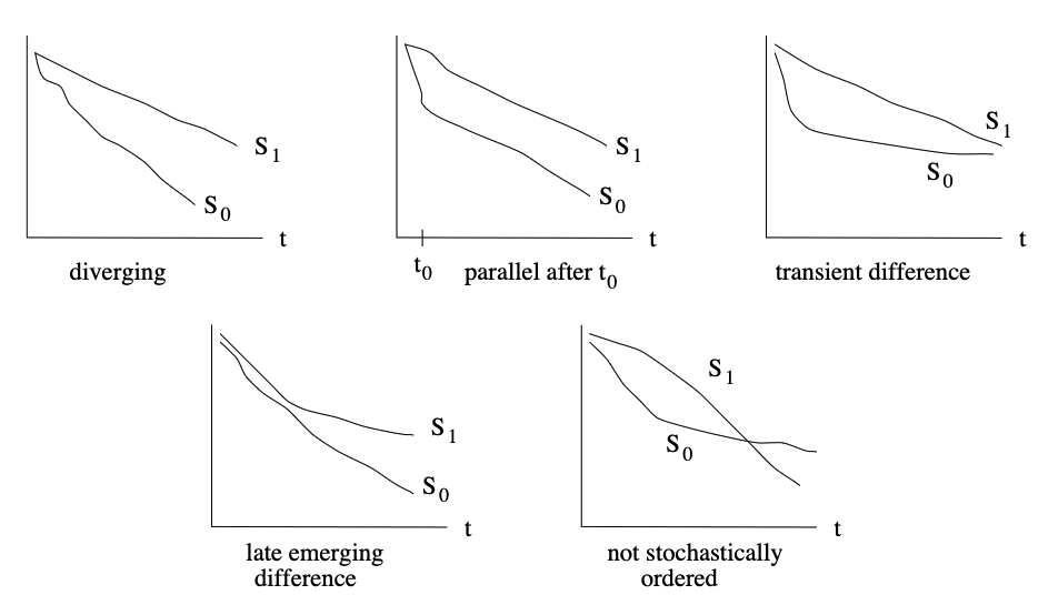
Two survival curves, related to a covariate, may exhibit different relative behaviour over time as sketched:

SurvivalCurves

(Illustration from STAT331 course, Stanford University)

The 'Kaplan-Meier' analysis is non-parametric, as it makes neither assumptions on the distribution of the outcome variable, nor on the functional form of the covariate(s). It is useful to visualize data on an as is basis.

There is a plethora of parametric models like 'exponential', log-normal', 'log-logistic', 'gamma', 'Weibull' etc. These models make specific assumptions on distributional aspects of the data, as well as the functional form of the covariate(s). Although not particularly helpful for our ongoing analysis, there is an example of parametric modelling of our dataset in Mini Appendix (E), just to demonstrate the principles of usage in lifelines.

The Cox proportional hazards model is a so-called semi-parametric model which makes no assumptions on the distribution of the outcome data, however it assumes a specific relationship between the covariate(s) and outcome. It is rather robust under various circumstances. Survival times generally do not follow a normal distribution. Moreover, with censored data, inspecting distributional assumptions can be difficult.

The major formal assumption, that the Cox proportional hazards model relies on, is, oh well ('ta-dah'), that of proportional hazards.

In a proportional hazards model, the unique effect of a unit increase in a covariate is multiplicative with respect to the hazard rate.

In cleartext: If the presence of a given risk factor doubles the risk for stroke, it is assumed that it does so in a time-independent manner

(i.e. the event-hazard for a bearer of the risk factor will be double that of an non-bearer, along the whole duration of follow-up).

A dataset that obviously violates the proportional hazards assumption would, for example, constitute of survival with or without a medical intervention that poses major increased short-term hazards, while conferring major benefits on long-term hazards, resulting in non-proportional hazards along the way.

Datasets with non-proportional hazards may be amenable to analysis by a Cox model with time-dependent covariates, or accelerated failure models, depending on data properties. All of this is beyond the scope of this non-technical notebook.

Check Proportional Hazards Assumption¶

We will use the most convenient option built into lifelines, to test for violation of the proportional hazards assumption:

In [35]:
cph.check_assumptions(survival_complete, p_value_threshold=0.05, show_plots=True)
Proportional hazard assumption looks okay.
Out[35]:
[]

Well, that seems like a clear statement. However, it is not overly verbose with regard to substantiation ;-)

For the time being, we will happy with that. Please refer to Mini Appendix (C) at the end of this notebook for a more elaborate discussion of testing the proportional hazards assumption in lifelines, and in general. In Mini Appendix (C) we will supply numeric test results, as well as graphic visualizations.

Our dataset does not violate the proportional hazards assumption. Our choice of the Cox Proportional Hazards model is vindicated.


Testing for Statistical Significance¶

Although the influence of higher education on mortality seems pretty robust, we shall finalize our analysis with a formal test.

Log-Rank Test¶

The log-rank test is a powerful hypothesis test to compare the survival distributions of two samples against the null hypothesis of no difference. It is a nonparametric test, and appropriate to use when the data are skewed and censored. It is widely used in clinical trials.

The log-rank test is dependent on the same assumptions as the Kaplan-Meier survival model - namely, that:

  • censoring is unrelated to prognosis (so-called non-informative censoring),
  • the survival probabilities are the same for subjects recruited early and late in the study (so-called lack of secular trend),
  • the status of event and censored should be mutually exclusive, and also collectively exhaustive,
  • the events happened at the times specified.

The log-rank test does not depend on the proportional hazards assumption. Overall, it is very versatile. A short discussion on rather rare cases, where the log-rank test may lose power, can be found in Mini Appendix (A).

The log-rank test assesses statistical significance, but does not estimate an effect size. That is the reason for employing both the Cox Proportional Hazards model (to derive hazard ratios and confidence intervals) as well as the log-rank test (to decide on the null hypothesis) in our analysis:

In [36]:
# Import log rank test statistics
from lifelines.statistics import logrank_test
# Prepare some variables for the test
durations = pd.DataFrame(survival_complete['TIMEDTH'])
event_observed = pd.DataFrame(survival_complete['DEATH'])
# Perform Log Rank Test
lrt = logrank_test(durations, event_observed) 
lrt.print_summary()
t_0 -1
null_distribution chi squared
degrees_of_freedom 1
test_name logrank_test
test_statistic p -log2(p)
0 9250.53 <0.005 inf

Our test result (P < 0.005) strongly suggests rejecting the null hypothesis of there being no survival difference between the two groups.

It looks like, overall, we can be rather confident in our conclusion, that a lack of higher education is a statistically significant, and clinically relevant risk factor for all cause mortality in the historic Framingham Study population.

Sadly, this remains true until this day...


Please bear in mind, however, that our whole exercise was not aimed at extracting meaning from the historic Framingham study, which merely served to keep things more interesting than an abstract dummy dataset would have been. The aim of this notebook was to demonstrate a use case for basic survival statistics, employing only open source tools along the way.

The "Three Pillars of Survival Analysis"¶

We have taken the opportunity to demonstrate all three of them:

1. Kaplan Meier Estimator: survival curves

2. Cox Proportional Hazards: hazard rates & confidence intervals

3. Log-Rank test: statistical significance

That's it for the main text of this notebook. You may take a peek at the mini appendices below.


If you have followed this rather verbose walkthrough till the end, I may congratulate you on your stamina ;-)


I would like to express my gratitude to all the wonderful people who contribute to these great projects, without which this humble document would never have come to be:

Long live open source!

Linux Penguin


Mini-Appendix (A): Nelson-Aalen Estimator of Hazard¶

As stated above, the log-rank test does not depend on the proportional hazards assumption. However, it may lose power and fail in situations, where hazard plots (not necessarily survival plots[!]) cross. Within this notebook, we will not provide a technical discussion. However, we may take a peek at the Nelson-Aalen Estimator of hazards from our data.

In [37]:
# Import methods
from lifelines import NelsonAalenFitter
# Define figure
fig, (ax1, ax2, ax3) = plt.subplots(1, 3, sharey=True, figsize=(10,5))
fig.suptitle("Nelson-Aalen Hazard Plot (lower/higher education)")
# Perform modeling
naf_lo = NelsonAalenFitter(nelson_aalen_smoothing=False)
naf_hi = NelsonAalenFitter(nelson_aalen_smoothing=False)
naf_lo.fit(T[lo_edu], event_observed=E[lo_edu], label="lower")
naf_hi.fit(T[hi_edu], event_observed=E[hi_edu], label="higher")
# Plot 
naf_lo.plot_hazard(ax=ax1, bandwidth=0.1)
naf_hi.plot_hazard(ax=ax1, bandwidth=0.1)
ax1.set_title("minimal smoothing", color = "#4C9900")
ax1.set(xlabel='(Years)')
naf_lo.plot_hazard(ax=ax2, bandwidth=0.5)
naf_hi.plot_hazard(ax=ax2, bandwidth=0.5)
ax2.set_title("moderate smoothing", color = "#4C9900")
ax2.set(xlabel='(Years)')
naf_lo.plot_hazard(ax=ax3, bandwidth=3)
naf_hi.plot_hazard(ax=ax3, bandwidth=3)
ax3.set_title("heavy smoothing", color = "#4C9900")
ax3.set(xlabel='(Years)')
# Additional Infos
plt.text(0, 0.13, 'mathias.elsner: CC BY-NC-SA', fontsize = 7, color = 'grey', style = 'italic')
# Set layout
plt.tight_layout()

Because the hazard is rather noisy, some amount of smoothing makes interpretation easier. Since the hazard sharply drops at study termination (all remaining subjects are right-censored without event), heavy smoothing results in an artificial, peculiar downward slope at the plot's tail.

The Nelson-Aalen hazard lines do not cross. Thus the log-rank test may be considered valid. However, the hazards seem to diverge a bit more markedly from roughly 12 years onwards. Going back to the Kaplan-Meier survival curves of our analysis, this effect may have been adumbrated from close scrutiny. However, the minor divergence of the curves was not marked enough to fail the proportional hazards assumption test. Thus, to the best of our knowledge, all methods seem to have been employed properly.

This Link will take you back to the main text ('Log-Rank Test' of Framingham data). You might consider, also having a look at the sketch in subsequent Mini Appendix (B) for clarification of terminology:


Mini Appendix (B): Of Hazard, Cumulative Hazard and Survival...¶

In statistics, terminology may often be confusing to the uninitiated. The mathematical relationship between survival, hazard and cumulative hazard is detailed on this wonderful image from the lifelines library documentation:

'CDF' denotes Cumulative Distribution Function.

'PDF' denotes Propability Density Function.

Visualized With Framingham Data¶

We will use the data from the main text (mortality over time with regard to educational status) to demonstrate the above relation visually:

In [38]:
# We do not have to import the methods, neither do we have to run the 
# fitters, because both of this has been done in previous cells.
# Define figure:
fig, (ax1, ax2, ax3) = plt.subplots(1, 3, sharey=False, figsize=(10,5))
fig.suptitle("Framingham Study (1948 ff.): Mortality Over Time by Educational Status")
# Plot Nelson-Aalen hazard (again)
naf_lo.plot_hazard(ax=ax1, bandwidth=0.5, ci_show=False)
naf_hi.plot_hazard(ax=ax1, bandwidth=0.5, ci_show=False)
ax1.set_title("Instantaneous Hazard", color = "#4C9900")
ax1.set(xlabel='(Years)')
ax1.text(8.7,0.047, '(smoothed)', fontsize = 9, color = "#4C9900", style = 'normal')
# Plot Nelson-Aalen cumulative hazard 
naf_lo.plot_cumulative_hazard(ax=ax2, ci_show=False)
naf_hi.plot_cumulative_hazard(ax=ax2, ci_show=False)
ax2.set_title("Cumulative Hazard", color = "#4C9900")
ax2.set(xlabel='(Years)')
# Plot Kaplan Meier for comparison
kmf_lo.plot_survival_function(ax=ax3, ci_show=False, label='lower')
kmf_hi.plot_survival_function(ax=ax3, ci_show=False, label='higher')
ax3.set(xlabel='(Years)')
ax3.set_title("Survival", color = "#4C9900")
# Additional Infos
plt.text(0,0.57, 'mathias.elsner: CC BY-NC-SA', fontsize = 7, color = 'grey', style = 'italic')
# Set layout
plt.tight_layout()

This Link will take you back to the main text ('Log-Rank Test' of Framingham data).


Mini Appendix (C): Testing Proportional Hazards Assumption¶

In the main body of this notebook, we have pragmatically tested our clinical analysis dataset for violoation of the proportional hazards assumption with the inbuilt check_hazards method from lifelines, circumventing any technical discussion. In this mini appendix we will expand a little bit on the topic of testing the proportional hazards assumption, as it is sometimes contested.

Background¶

A number of tests have been developed for the proporional hazards assumption, i.e. Cox (1972), Gill & Schumacher (1987), Harrell (1986), Lin (1991), Moreau, O'Quigley & Mesbah (1985), Nagelkerke, Oosting & Hart (1984), O'Quigley & Pessione (1989), Schoenfeld (1980) and Wei (1984). The often-cited standard works on this topic are by Grambsch and Therneau (1994) & Therneau and Grambsch (2000). I must admit, frankly, that a lot of details are beyond my humble understanding of statistics as a clinician.

Amongst the statistics community, there seem to be several distinct schools of thought with regard to the necessitiy of testing the proportional hazards (PH) assumption:

  1. Some calling for rigorous formal testing of the PH assumption (advocating one or several of the plethora of tests);

  2. Others altogether denying the benefit of formal testing, since, in their opinion,

    a) all proposed tests have inadequate discriminatory power,

    b) different PH tests often lead to conflicting results,

    c) severe violations of the PH assumption should be inferable from data visualization (e.g. crossing of survival curves etc.),

    d) violations that are flagged only by PH-tests (not deducible from visualization) might not be relevant;

  3. Some, with whom we tend to agree, try to cover the middle ground by advocating both, formal testing and checking plausibility through descriptive analysis.

According to Park & Hendry (2015), statistical tests of the proportional hazards assumption fall into three general classes:

(A) tests focusing on piecewise estimation of models for subsets of data defined by stratification of time;

(B) tests focusing on interactions between covariates and some function of time; and

(C) tests based on examinations of regression residuals.

The lifelines library provides an inbuilt statistical test for CPH assumption to test for any time-varying coefficients. A time-varying coefficient implies a covariate’s influence relative to the baseline changes over time. This implies a violation of the proportional hazard assumption. The null hypothesis is that the coefficient is not time-varying.

Testing the PH assumption in lifelines¶

The library provides two options to access the test:

(a) check_assumptions can be called from within the cph model [as we have done in the main body of our notebook].

(b) proportional_hazard_test can be run seperately.

For our data, check_assumptions output is rather terse, and currently omits the visualization (see again 'NOTE' further below). That's why I have included the more explicit proportional_hazards_test as well. In order to rule out dominant influence of outliers, the test is run seperately with four transformations of time:

  1. Identity (no transformation)
  2. Rank
  3. Logarithmic
  4. Kaplan-Meier.

First, let us replay (a)check_assumptions, so that we don't have to scroll up and down between main text and appendix when comparing the output of both options:

In [39]:
cph.check_assumptions(survival_complete, p_value_threshold=0.05, show_plots=True)
Proportional hazard assumption looks okay.
Out[39]:
[]

NOTE: check_assumptions should, in addition to the above summary test result, also plot scaled Schoenfeld residuals and bootstrapped lowess lines for visual confirmation, if so specified. Unfortunetaly, the tool currently omits visualization, whenever the proportional hazard assumption is not violated. I have opened an 'issue' on the lifelines GitHub repository. The issue is still open. We will thus prepare a homemade plot of our own further below.

UPDATE: On 2023-05-01, the main developer of the lifelines project kindly accepted my minor code revision. Thus, from the next release onwards, check_assumptions will supply Schoenfeld residual plots, whenever the user specifies show_plots = True, regardless of numeric test result. Those with a technical interest will find the modified check_assumptions function code in a postscriptum at the end of this appendix.

Now, however, we will run the explicit (b)proportional_hazards_test for the four transformations of time, in order to attain a somewhat more verbose result:

In [40]:
from lifelines.statistics import proportional_hazard_test
for transform_spec in ['identity', 'log', 'rank', 'km']:
    results = proportional_hazard_test(cph, survival_complete, time_transform=transform_spec)
    results.print_summary(decimals=3, model="untransformed variables")
time_transform identity
null_distribution chi squared
degrees_of_freedom 1
model <lifelines.CoxPHFitter: fitted with 4321 total...
test_name proportional_hazard_test
test_statistic p -log2(p)
higher 0.00 0.96 0.06
time_transform log
null_distribution chi squared
degrees_of_freedom 1
model <lifelines.CoxPHFitter: fitted with 4321 total...
test_name proportional_hazard_test
test_statistic p -log2(p)
higher 0.00 0.97 0.05
time_transform rank
null_distribution chi squared
degrees_of_freedom 1
model <lifelines.CoxPHFitter: fitted with 4321 total...
test_name proportional_hazard_test
test_statistic p -log2(p)
higher 0.00 0.95 0.07
time_transform km
null_distribution chi squared
degrees_of_freedom 1
model <lifelines.CoxPHFitter: fitted with 4321 total...
test_name proportional_hazard_test
test_statistic p -log2(p)
higher 0.00 0.95 0.07

What about visualization?¶

As a clinician, with decades of working in a field heavily dependent on medical imaging, I would feel more at ease having a visual confirmation of the test results. This is of major importance when, for example, the proportional hazards test may fail because of outliers, which cannot be deduced from the numerical test result on its own.

Since the inbuilt test in lifelines, at the time of writing, did not provide visualization of the scaled Schoenfeld residuals, when the PH assumption is met, we had to construct a graph of our own device.

Data preparation¶

The computation of Schoenfeld residuals in lifelines presupposes that the CPH model has already been trained on the dataset at hand. Since the last run of the CPH model in our 'clinical analysis' section of this notebook was performed on the same dataset of 'survival_complete', it would not be necessary to rerun the model here. We will do so, anyway, to make sure that this code cell will execute properly, in case that we may move its position within the notebook in the future.

First, we will compute scaled Schoenfeld residuals:

In [41]:
# Rerun CoxPHfitter
cph.fit(survival_complete, 'TIMEDTH', 'DEATH')
# Prepare scaled Schoenfeld residuals
scaled_schoenfeld_residuals = cph.compute_residuals(survival_complete, kind='scaled_schoenfeld')
print("\033[1mScaled Schoenfeld residuals computation result:\033[0m")
print(scaled_schoenfeld_residuals)
Scaled Schoenfeld residuals computation result:
covariate    higher
1284      -1.836503
2394      -1.837050
2042      -1.837596
1876      -1.838143
2070      -1.838691
...             ...
1431      -2.047287
2176       1.961665
3546      -2.047581
1956      -2.048540
1858      -2.049500

[1509 rows x 1 columns]

Since we have used an inbuilt method, we will have to do with the result, which is somewhat unsatisfactory for our use case. The ordering of the index seems peculiar, and the dataset does not contain any information of time, which is what we would like to plot the residuals against.

Thus, we will shuffle the data a little bit:

In [42]:
# Sort residuals by index for later comparison with original dataset
schoenfeld_sorted=scaled_schoenfeld_residuals.sort_index()
print("\033[1mScaled Schoenfeld residuals sorted by index:\033[0m")
print(schoenfeld_sorted)
Scaled Schoenfeld residuals sorted by index:
covariate    higher
3          2.134646
13         2.077670
14         2.038455
15         2.167767
17         2.156165
...             ...
4426      -1.838839
4427      -1.894075
4428       1.990486
4429       2.036925
4430      -1.978273

[1509 rows x 1 columns]

Now we will prepare a subset of our clinical dataset which will contain only participants experiencing the event at question (the 1509 fatality cases). We will use this dataset to extract the time information for our residuals, which is not included in the above function's return.

In [43]:
# Subset: participants with event
survival_DEATH=survival_complete.loc[survival_complete.DEATH.eq(1)]
print("\033[1mParticipants with DEATH event:\033[0m")
print(survival_DEATH)
Participants with DEATH event:
      TIMEDTH  DEATH  higher
3        2956      1     1.0
13       5592      1     1.0
14       6411      1     1.0
15        146      1     1.0
17       1442      1     1.0
...       ...    ...     ...
4426      565      1     0.0
4427     4300      1     0.0
4428     7746      1     1.0
4429     6433      1     1.0
4430     6729      1     0.0

[1509 rows x 3 columns]

We will merge the fatalities dataframe survival_DEATH with the sorted residuals dataframe schoenfeld_sorted. Oops - both dataframes contain a column named 'higher', with disparate content. However, this shall not bother us too much, as it will be taken care of by the merge function:

In [44]:
merged_Sr_sD = survival_DEATH.copy('deep')
merged_Sr_sD = merged_Sr_sD.merge(schoenfeld_sorted, left_index=True, right_index=True)
print(merged_Sr_sD)
      TIMEDTH  DEATH  higher_x  higher_y
3        2956      1       1.0  2.134646
13       5592      1       1.0  2.077670
14       6411      1       1.0  2.038455
15        146      1       1.0  2.167767
17       1442      1       1.0  2.156165
...       ...    ...       ...       ...
4426      565      1       0.0 -1.838839
4427     4300      1       0.0 -1.894075
4428     7746      1       1.0  1.990486
4429     6433      1       1.0  2.036925
4430     6729      1       0.0 -1.978273

[1509 rows x 4 columns]

Now, let's sort the merged dataframe by event time ('TIMEDTH'):

In [45]:
merged_Sr_sD = merged_Sr_sD.sort_values(by=['TIMEDTH'])
print(merged_Sr_sD)
      TIMEDTH  DEATH  higher_x  higher_y
1284       26      1       0.0 -1.836503
2394       34      1       0.0 -1.837050
2042       40      1       0.0 -1.837596
1876       45      1       0.0 -1.838143
2070       46      1       0.0 -1.838691
...       ...    ...       ...       ...
2176     8744      1       1.0  1.961665
1431     8744      1       0.0 -2.047287
3546     8747      1       0.0 -2.047581
1956     8753      1       0.0 -2.048540
1858     8759      1       0.0 -2.049500

[1509 rows x 4 columns]

Plotting scaled Schoenfeld residuals¶

We would like to plot the residuals against time. In our case, for the sake of simplicity, we will use untransformed time.

For data that fulfill the proportional hazards assumption, Schoenfed residuals will perform a noisy random walk around the zero-line. Thus some nonparametric smoothing is helpful for interpretation. We will use LOWESS lines ('locally weighted scatterplot smoothing').

In [46]:
# Import LOWESS lines
from statsmodels.nonparametric.smoothers_lowess import lowess
# Prepare two datasets with different amounts of smoothing
schoenfeld_smooth = lowess(merged_Sr_sD['higher_y'], merged_Sr_sD['TIMEDTH'], is_sorted=False, frac=0.75, it=0)
schoenfeld_coarse = lowess(merged_Sr_sD['higher_y'], merged_Sr_sD['TIMEDTH'], is_sorted=False, frac=0.01, it=0)

Now we will plot the scaled Schoenfeld residuals (from the lifelines output) against time (from our fatalities subset of our original dataset). We will do so in three formats:

  1. Raw residuals data as scatterplot
  2. Minimal smoothing LOWESS line
  3. Heavy smoothing LOWESS line.

For data that fulfill the proportional hazards assumption, the heavily smoothed lowess line should exhibit zero slope and should, more or less, follow the zero-line.

In [47]:
# Define figure
plt.figure(figsize=(10,5))
# PLOT RAW RESIDUALS AS SCATTERPLOT:
plt.plot(merged_Sr_sD['TIMEDTH'], merged_Sr_sD['higher_y'], 'b.', markersize=5)
# Plot LOWESS lines
plt.plot(schoenfeld_smooth[:,0], schoenfeld_smooth[:,1], 'r', linewidth=3)
plt.plot(schoenfeld_coarse[:,0], schoenfeld_coarse[:,1], 'g', linewidth=0.2)
# Plot additional info
plt.xlabel("Untransformed Time (days)", fontsize=12, color='black')#
plt.ylabel("Scaled Schoenfeld-Residuals", fontsize=12)
plt. title("Scaled Schoenfeld-Residuals", fontsize=16, color='black')
# Additional Infos
plt.text(0,-2.3, 'mathias.elsner: CC BY-NC-SA', fontsize = 7, color = 'grey', style = 'italic')
plt.ylim([-2.5,2.5])
plt.grid(visible=True, which='both', axis='y', color='darkgrey', linestyle='-', linewidth=0.25)

Our humble homemade visualization corroborates the findings of the test result.

Just to demonstrate, why we have used a scatterplot for the raw residuals, instead of a lineplot, and to demonstrate the necessity for smoothing:

In [48]:
# Define figure
plt.figure(figsize=(10,5))
#PLOT RAW RESIDUALS AS LINES
plt.plot(merged_Sr_sD['TIMEDTH'], merged_Sr_sD['higher_y'], 'b', linewidth=0.1)
# Plot LOWESS lines
plt.plot(schoenfeld_smooth[:,0], schoenfeld_smooth[:,1], 'r', linewidth=3)
plt.plot(schoenfeld_coarse[:,0], schoenfeld_coarse[:,1], 'g', linewidth=0.5)
# Plot additional info
plt.xlabel("Untransformed Time (days)", fontsize=12, color='black')#
plt.ylabel("Scaled Schoenfeld-Residuals", fontsize=12)
plt. title("Scaled Schoenfeld-Residuals", fontsize=16, color='black')
# Additional Infos
plt.text(0,-2.3, 'mathias.elsner: CC BY-NC-SA', fontsize = 7, color = 'grey', style = 'italic')
plt.ylim([-2.5,2.5])
plt.grid(visible=True, which='both', axis='y', color='darkgrey', linestyle='-', linewidth=0.25)

This link will take you back to the main text (at 'Check Proportional Hazards Assumption' of the Framingham data).

As an afterthought, I have provided a little postscriptum below, which shows my modification of the lifelines code for the check_assumptions function, that will ensure plotting. This is optional reading for those with a technical interest:


Postscriptum to Mini Appendix (C)¶

Depending on your background, it might be adviseable to read Mini Appendix (C) first, if you have followed a link straight here.

The inconsistent behaviour of the check_assumptionsfunction was nagging, for sure...

My respective 'issue' on the lifelines GitHub repository was still open after a few days. Thus I had a look at the project's 65,000 SLOC code base, and made a minor revision to the file mixins.py in the /lifelines/fitters section, that fortunately has solved the issue.

I have repositioned the code snippet for plotting within the check_assumptions function, so that it is no longer skipped on the condition of a non-significant P-value from the proportional_hazard_test. Thus, plots are generated, whenever the argument show_plots = True is passed to the function by the user.

This change, is advantageous for two reasons:

  1. Consistency of check_assumptions behaviour (in line with users' explicit directive).
  2. Visual plausibility checking enabled, regardless of numeric test result (in line with the recommendation of most experts in the field).

In order to demonstrate the modified behaviour of check_assumptions I have included a lengthy code section for it to work standalone:

In [49]:
# This cell contains the code snippet from mixins.py in lifelines that defines
# the check_assumptions function, as modified according to my pull request.
# Code is truncated to the section necessery for running the function within this notebook.
# Imports that we have already done, are commented out. Some imports are redundant, 
# as the lifelines code base uses different wording, that has been retained for compatability.

# I have renamed the function to `check_assumptions_forceplot` for the purpose
# of this code cell in our notebook, in order to avoid conflicts with the original function
# from the lifelines project.

# (...)
from typing import List, Optional, Dict, Any, Iterable
from textwrap import dedent, fill
#from autograd import numpy as anp
#import numpy as np
from pandas import DataFrame, Series
from lifelines.statistics import proportional_hazard_test, TimeTransformers
from lifelines.utils import format_p_value
from lifelines.utils.lowess import lowess

class ProportionalHazardMixin:
    def check_assumptions_forceplot(
        self,
        training_df: DataFrame,
        advice: bool = True,
        show_plots: bool = False,
        p_value_threshold: float = 0.01,
        plot_n_bootstraps: int = 15,
        columns: Optional[List[str]] = None,
    ) -> None:
        """
        Use this function to test the proportional hazards assumption. See usage example at
        https://lifelines.readthedocs.io/en/latest/jupyter_notebooks/Proportional%20hazard%20assumption.html
        Parameters
        -----------
        training_df: DataFrame
            the original DataFrame used in the call to ``fit(...)`` or a sub-sampled version.
        advice: bool, optional
            display advice as output to the user's screen
        show_plots: bool, optional
            display plots of the scaled Schoenfeld residuals and loess curves. This is an eyeball test for violations.
            This will slow down the function significantly.
        p_value_threshold: float, optional
            the threshold to use to alert the user of violations. See note below.
        plot_n_bootstraps:
            in the plots displayed, also display plot_n_bootstraps bootstrapped loess curves. This will slow down
            the function significantly.
        columns: list, optional
            specify a subset of columns to test.
        Returns
        --------
            A list of list of axes objects.
        Examples
        ----------
        .. code:: python
            from lifelines.datasets import load_rossi
            from lifelines import CoxPHFitter
            rossi = load_rossi()
            cph = CoxPHFitter().fit(rossi, 'week', 'arrest')
            axes = cph.check_assumptions(rossi, show_plots=True)
        Notes
        -------
        The ``p_value_threshold`` is arbitrarily set at 0.01. Under the null, some covariates
        will be below the threshold (i.e. by chance). This is compounded when there are many covariates.
        Similarly, when there are lots of observations, even minor deviances from the proportional hazard
        assumption will be flagged.
        With that in mind, it's best to use a combination of statistical tests and eyeball tests to
        determine the most serious violations.
        References
        -----------
        section 5 in https://socialsciences.mcmaster.ca/jfox/Books/Companion/appendices/Appendix-Cox-Regression.pdf,
        http://www.mwsug.org/proceedings/2006/stats/MWSUG-2006-SD08.pdf,
        http://eprints.lse.ac.uk/84988/1/06_ParkHendry2015-ReassessingSchoenfeldTests_Final.pdf
        """

        if not training_df.index.is_unique:
            raise IndexError(
                "`training_df` index should be unique for this exercise. Please make it unique or use `.reset_index(drop=True)` to force a unique index"
            )

        residuals = self.compute_residuals(training_df, kind="scaled_schoenfeld")
        test_results = proportional_hazard_test(self, training_df, time_transform=["rank", "km"], precomputed_residuals=residuals)

        residuals_and_duration = residuals.join(training_df[self.duration_col])
        Xs = self.regressors.transform_df(training_df)

        counter = 0
        n = residuals_and_duration.shape[0]
        axes = []

        for variable in self.params_.index.intersection(columns or self.params_.index):
            minumum_observed_p_value = test_results.summary.loc[variable, "p"].min()
            
            # Repositioned plotting so that it is not conditional on violation of the PH assumption
            if show_plots:
                axes.append([])
                print()
                print("   Bootstrapping lowess lines. May take a moment...")
                print()
                from matplotlib import pyplot as plt

                fig = plt.figure()

                # plot variable against all time transformations.
                for i, (transform_name, transformer) in enumerate(TimeTransformers().iter(["rank", "km"]), start=1):
                    p_value = test_results.summary.loc[(variable, transform_name), "p"]

                    ax = fig.add_subplot(1, 2, i)

                    y = residuals_and_duration[variable]
                    tt = transformer(self.durations, self.event_observed, self.weights)[self.event_observed.values]

                    ax.scatter(tt, y, alpha=0.75)

                    y_lowess = lowess(tt.values, y.values)
                    ax.plot(tt, y_lowess, color="k", alpha=1.0, linewidth=2)

                    # bootstrap some possible other lowess lines. This is an approximation of the 100% confidence intervals
                    for _ in range(plot_n_bootstraps):
                        ix = sorted(np.random.choice(n, n))
                        tt_ = tt.values[ix]
                        y_lowess = lowess(tt_, y.values[ix])
                        ax.plot(tt_, y_lowess, color="k", alpha=0.30)

                    best_xlim = ax.get_xlim()
                    ax.hlines(0, 0, tt.max(), linestyles="dashed", linewidths=1)
                    ax.set_xlim(best_xlim)

                    ax.set_xlabel("%s-transformed time\n(p=%.4f)" % (transform_name, p_value), fontsize=10)
                    axes[-1].append(ax)

                fig.suptitle("Scaled Schoenfeld residuals of '%s'" % variable, fontsize=14)
                plt.tight_layout()
                plt.subplots_adjust(top=0.90)

            if np.round(minumum_observed_p_value, 2) > p_value_threshold:

                continue

            counter += 1

            if counter == 1:
                if advice:
                    print(
                        fill(
                            """The ``p_value_threshold`` is set at %g. Even under the null hypothesis of no violations, some covariates will be below the threshold by chance. This is compounded when there are many covariates. Similarly, when there are lots of observations, even minor deviances from the proportional hazard assumption will be flagged."""
                            % p_value_threshold,
                            width=100,
                        )
                    )
                    print()
                    print(
                        fill(
                            """With that in mind, it's best to use a combination of statistical tests and visual tests to determine the most serious violations. Produce visual plots using ``check_assumptions(..., show_plots=True)`` and looking for non-constant lines. See link [A] below for a full example.""",
                            width=100,
                        )
                    )
                    print()
                test_results.print_summary()
                print()

            print()
            print(
                "%d. Variable '%s' failed the non-proportional test: p-value is %s."
                % (counter, variable, format_p_value(4)(minumum_observed_p_value)),
                end="\n\n",
            )

            if advice:
                values = Xs["beta_"][variable]
                value_counts = values.value_counts()
                n_uniques = value_counts.shape[0]

                # Arbitrary chosen to check for ability to use strata col.
                # This should capture dichotomous / low cardinality values.
                if n_uniques <= 6 and value_counts.min() >= 5:
                    print(
                        fill(
                            "   Advice: with so few unique values (only {0}), you can include `strata=['{1}', ...]` in the call in `.fit`. See documentation in link [E] below.".format(
                                n_uniques, variable
                            ),
                            width=100,
                        )
                    )
                else:
                    print(
                        fill(
                            """   Advice 1: the functional form of the variable '{var}' might be incorrect. That is, there may be non-linear terms missing. The proportional hazard test used is very sensitive to incorrect functional forms. See documentation in link [D] below on how to specify a functional form.""".format(
                                var=variable
                            ),
                            width=100,
                        ),
                        end="\n\n",
                    )
                    print(
                        fill(
                            """   Advice 2: try binning the variable '{var}' using pd.cut, and then specify it in `strata=['{var}', ...]` in the call in `.fit`. See documentation in link [B] below.""".format(
                                var=variable
                            ),
                            width=100,
                        ),
                        end="\n\n",
                    )
                    print(
                        fill(
                            """   Advice 3: try adding an interaction term with your time variable. See documentation in link [C] below.""",
                            width=100,
                        ),
                        end="\n\n",
                    )

        if advice and counter > 0:
            print(
                dedent(
                    r"""
                ---
                [A]  https://lifelines.readthedocs.io/en/latest/jupyter_notebooks/Proportional%20hazard%20assumption.html
                [B]  https://lifelines.readthedocs.io/en/latest/jupyter_notebooks/Proportional%20hazard%20assumption.html#Bin-variable-and-stratify-on-it
                [C]  https://lifelines.readthedocs.io/en/latest/jupyter_notebooks/Proportional%20hazard%20assumption.html#Introduce-time-varying-covariates
                [D]  https://lifelines.readthedocs.io/en/latest/jupyter_notebooks/Proportional%20hazard%20assumption.html#Modify-the-functional-form
                [E]  https://lifelines.readthedocs.io/en/latest/jupyter_notebooks/Proportional%20hazard%20assumption.html#Stratification
            """
                )
            )

        if counter == 0:
            print("Proportional hazard assumption looks okay.")
        return axes
# (...)

Let's run the modified function:

In [50]:
ProportionalHazardMixin.check_assumptions_forceplot(cph, training_df=survival_complete, p_value_threshold=0.05, show_plots=True)
   Bootstrapping lowess lines. May take a moment...

Proportional hazard assumption looks okay.
Out[50]:
[[<Axes: xlabel='rank-transformed time\n(p=0.9539)'>,
  <Axes: xlabel='km-transformed time\n(p=0.9540)'>]]

Yup! 👍 😃¶

The modified code works as expected. No big deal (but for me 😉).

My pull request was accepted and merged with the master branch of the _lifelines_ library on 2023-05-01. Having contributed even a minuscule snippet to this great project makes me very happy.

This link will, at long last, take you back to the main text.


Mini Appendix (D): Cursory Introduction to Survival Analysis¶

What is Survival Analysis?¶

The term "Survival Analysis" subsumes a bundle of methods in statistics, employed to evaluate data on time-dependent events.

Although historically often used to track mortality over time in medical research, survival analysis has much broader applications beyond fatalities. Thus it should best be rephrased as "Time to Event Analysis". The historic moniker, however, has stuck.

Amongst a broad range of potential use cases for survival analysis would be evaluation of time until:

  • nonfatal myocardial infarction occurs
  • customers cancel maintenance contracts
  • couples get divorced
  • chess novices win their first match
  • laboratory mice find the exit to a maze
  • political coalitions break up
  • players achieve a lottery win
  • mechanical failure of bearings occurs
  • (...)

In survival analysis, unlike most other medical statistics, two very different domains are of interest:

  1. The dichotomous fact that an event has or has not occured ('outcome variable', 'event variable', 'dependent variable')
  2. The time from the beginning of observation until the occurence of the event ('time to event variable').

Survival analysis can be used to assess the influence of one or several factors ('covariates', 'predictor variables', 'independent variables') on the occurence and temporal distribution of events.

Survival analysis is useful for scenarios, in which the event of interest is not experienced by the entire study population, by the end of the study period. This is the norm, rather than the exception in clinical trials, which are of finite duration by nature.

What is Censoring?¶

The concept of censoring is central to survival analysis. Censoring means incomplete observation of survival times. Study subjects with an incomplete observation are referred to as censored.

Traditionally, in our culture, timelines are depicted as evolving from left to right. Thus:

  • Incomplete information on a subject, from the time prior to our observation, is called left-censored,
  • Incomplete information on a subject, from the time beyond our observation, is called right-censored.

Right censoring occurs when participants:

  • drop out of the study (i.e. withdraw consent),
  • are lost to follow-up,
  • remain event-free at study termination.

There may be other forms of censoring, which we will not cover here (e.g. interval-censoring, when the exact point in time of occurrence is unknown, but is known to lie between two observed points in time).

Our statistical standard methods work under the assumption that the data exhibit non-informative censoring (sometimes also called random censoring). This means that censoring is independet of survival, or the occurence of the event under study.

An example for nonrandom censoring would be Roman gladiators successfully escaping from the arena (thus 'withdrawing from the study') and being right-censored. This censoring would, most probably, relate to survival.

A converse example for nonrandom censoring might be all patients too old or too sick to drive to their follow-up appointment at a clinic being 'lost to follow-up', thus being right-censored. This censoring presumably would be related to survival, or rather a lack thereof.

Informative censoring may also be introduced by competing risks (i.e. cardiovascular mortality in breast cancer survival studies). Methods have been developed to 'decontaminate' models in this setting. However, these are beyond the scope of this notebook.

Example: "Silly Sunburn Study"¶

Let us visualize a hypothetical mini study of sun-naïve subjects sunbathing in tropical climate without protection (idiots).

  • The event of interest shall be occurence of sunburn of at least grade II severity.
  • The time considered shall be hours of continuous sunbath, until sunburn occurs.

We will start our observational study at 10:00. We will note time in 24 hr format. We will close our observational period at 15:00, after a study duration of 5 hours. However,

  • not all participants will enter the study (show up on the beach) at the same time,
  • not all participants may experience the event (sunburn) at all,
  • not all participants experiencing sunburn will exhibit symptoms simultaneously,
  • participants may experience sunburn after the end of observation (spending the late afternoon on the beach)
  • participants may drop out of our silly study by withdrawing consent,
  • participants may leave the beach without telling us, thus being lost to follow-up (we do not know their sunburn outcome)

Special cases: Violation of inclusion or exclusion criteria may occur, e.g.

  • participants may enter the study, having already experienced the event (being sunburnt from the day before).
  • participants may enter the beach earlier than our observation (i.e. early in the morning), thus being subject to unobserved sun exposure.

Whichever of the following occurs first, the study duration for each participant is noted:

  1. event (time of detecting sunburn symptoms)
  2. drop out (time of leaving the beach)
  3. lost to follow-up (time last seen, if observed)
  4. end of study (study closed at 15:00 for all remaining subjects)

Don't fret too much about the table. We will provide a graphical overview further down...

Index Name Enter Beach Exhibit Sunburn Drop Out Lost to f'up
0 Jack 10:00 yes (12:00) no no
1 Jill 11:00 no no no
2 Joe 11:00 yes (17:00) no no
3 Jane 10:00 yes (13:00) yes (14:00) no
4 Huey 12:00 no yes (13:00) no
5 Dewey 10:00 yes† (14:00) no yes (??:??)
6 Louie 08:00 yes (12:00) no no

†: Dewey has experienced sunburn at 14:00, however we do not know about this in our study, because somehow, we have lost him out of sight. Thus we are unable to observe the event or examine him afterwards...

Data Preparation (Part I)¶

We will prepare the data for visualization step by step. Those with any experience at all, in data manipulation with Python, may skip this section.

In [51]:
# Prepare an empty pandas dataframe
sunburn_study = pd.DataFrame(columns=['name','enter_TIME','sunburn','sunburn_TIME','dropout','dropout_TIME','lost','lost_TIME']
                             , index=[0,1,2,3,4,5,6])
print(sunburn_study)
  name enter_TIME sunburn sunburn_TIME dropout dropout_TIME lost lost_TIME
0  NaN        NaN     NaN          NaN     NaN          NaN  NaN       NaN
1  NaN        NaN     NaN          NaN     NaN          NaN  NaN       NaN
2  NaN        NaN     NaN          NaN     NaN          NaN  NaN       NaN
3  NaN        NaN     NaN          NaN     NaN          NaN  NaN       NaN
4  NaN        NaN     NaN          NaN     NaN          NaN  NaN       NaN
5  NaN        NaN     NaN          NaN     NaN          NaN  NaN       NaN
6  NaN        NaN     NaN          NaN     NaN          NaN  NaN       NaN

Our dataframe, up to now, is entirely populated with 'NaN', short for 'Not a Number', referring to empty data cells.

In [52]:
# Populate dataframe with data
# For readability, we will fist construct one-dimensional series
name = np.array         (['Jack', 'Jill', 'Joe', 'Jane', 'Huey', 'Dewey', 'Louie'])
enter_TIME = np.array   ([   10,     11,    11,     10,     12,      10,       8 ])
sunburn = np.array      ([    1,      0,     1,      1,      0,       1,       1 ])
sunburn_TIME = np.array ([   12,      0,    17,     13,      0,      14,      12 ])
dropout = np.array      ([    0,      0,     0,      1,      1,       0,       0 ])
dropout_TIME = np.array ([    0,      0,     0,     14,     13,       0,       0 ])
lost = np.array         ([    0,      0,     0,      0,      0,       1,       0 ])
lost_TIME = np.array    ([    0,      0,     0,      0,      0,  np.nan,       0 ])
# Now we will write the data from our series to the dataframe
for i in range(7):
    sunburn_study.loc[i] = pd.Series({'name':name[i], 'enter_TIME':enter_TIME[i], 
                                      'sunburn':sunburn[i],'sunburn_TIME':sunburn_TIME[i], 'dropout':dropout[i], 
                                      'dropout_TIME':dropout_TIME[i], 'lost':lost[i], 'lost_TIME':lost_TIME[i]})
print(sunburn_study)
    name enter_TIME sunburn sunburn_TIME dropout dropout_TIME lost lost_TIME
0   Jack         10       1           12       0            0    0       0.0
1   Jill         11       0            0       0            0    0       0.0
2    Joe         11       1           17       0            0    0       0.0
3   Jane         10       1           13       1           14    0       0.0
4   Huey         12       0            0       1           13    0       0.0
5  Dewey         10       1           14       0            0    1       NaN
6  Louie          8       1           12       0            0    0       0.0

Our dataframe represents the information from our handmade table above.

Strictly speaking, sunburn_TIME for Dewey should also be set to 'NaN', since we do not observe his event. We will leave the time of his unobserved event included for the moment, for purpose of visualization.

Visualization of Raw Data¶

At first glance, the ensuing graph may look a bit cluttered, becaue it is ;-)

However, we will go through it, step by step, and we will consolidate and simplify the dataset for further analysis.

In [53]:
# Define figure
fig, ax = plt.subplots(figsize=(10,5))
y_pos = np.arange(len(sunburn_study['name']))
ax.set_yticks(y_pos, labels=sunburn_study['name'], fontsize=14)

plt.title("Sunburn Study: Raw Data Visualization", fontsize=16,color="#4C9900")
plt.xlim([7,18])
plt.ylim([6.5,-0.5])
plt.grid(visible=True, which='both', axis='y', color='darkgrey', linestyle='-', linewidth=1)
plt.axvline(x=10, color='b', linestyle=':')
plt.axvline(x=15, color='b', linestyle=':')
# Additional Infos
plt.text(15.4, 6.3, 'mathias.elsner: CC BY-NC-SA', fontsize = 7, color = 'grey', style = 'italic')

# For such a simple plot, a matrix of explicit coordinates, symbols and colors
# would have been more efficient, however this is an example, that could easily be reused
# for larger datasets.
for i in range(7):
    eT = sunburn_study.loc[i,'enter_TIME']
    sT = sunburn_study.loc[i,'sunburn_TIME']
    dT = sunburn_study.loc[i,'dropout_TIME'] 
    lT = sunburn_study.loc[i,'lost_TIME']
    if eT < 10:
        dot_color = 'darkgrey'
    else:
        dot_color = 'green'
    plt.plot(eT, i, '>', color=dot_color, markersize=15)
    if sunburn_study.loc[i,'sunburn']==1:
        if sT > 15:
            dot_color = 'darkgrey'
        elif (sT > dT) & (sunburn_study.loc[i,'dropout']==1):
            dot_color = 'darkgrey' 
        elif (sT > lT) & (sunburn_study.loc[i,'lost']==1):
            dot_color = 'darkgrey' 
        elif sunburn_study.loc[i,'lost']==1:
            if np.isnan(lT)==True:
                dot_color = 'darkgrey'  
        else:
            dot_color = 'red'
        plt.plot(sT, i, '.', color=dot_color, markersize=25)
    if sunburn_study.loc[i,'dropout']==1:
        if sunburn_study.loc[i,'sunburn']==1 & (sT<dT):
           dot_color='darkgrey'
        else:
            dot_color='blue'
        plt.plot(dT, i, '^', color=dot_color, markersize=15)
    if sunburn_study.loc[i,'lost']==1:
        plt.plot(lT, i, 'x', color='blue', markersize=15)
    if sunburn_study.loc[i,'dropout']==0: 
        if sunburn_study.loc[i,'sunburn']==0: 
            plt.plot(15, i, '<', color='blue', markersize=15)
    if sunburn_study.loc[i,'sunburn']==1:
        if sT > 15:
            plt.plot(15, i, '<', color='blue', markersize=15)
            

Let us have a look at our study participants, one by one:

0. Jack:  EVENT after 2 hs 
1. Jill:  CENSD after 4 hs (no event at study termination)
2. Joe:   CENSD after 4 hs (gets his sunburn after study termination, thus event not observed)
3. Jane:  EVENT after 3 hs (withdraws after event, which is not our concern)
4. Huey:  CENSD after 1 hr (withdraws from study without event)
5. Dewey: ????? after ? hr (entirely lost to follow-up, we do not observe his sunburn,
                            neither do we have any observation on him prior to his escape)†
6. Louie: EVENT after 2 hr (has in fact been sunbathing for 4 hs, unknown to the study)††


†: Dewey sadly has disappeared without notice, at an unknown point in time. We do not have any observation on him prior to being lost. If we had a timed observation on him ('last seen without sunburn'), we could properly right-censor him, and keep him included for analysis. As it is, we only have missing values (NaN) for him.

††: Since Louie's prior sunbath is unknown to us, strictly speaking from the study's point of view, he should be marked with a green triangle at 10:00 as we are unaware of him being left-censored.
  • Joe demonstrates, that we will always miss events, since our studies cannot be of indefinite duration
  • Jane and Huey demonstrate, that drop-outs can still be analyzed for the purpose of the study, although we will have to make do with sparse observations.
  • Dewey demonstrates that losing subjects to follow-up is a problem that cannot fully be fixed by statistical methods. Since we do not have event data for him, we will exclude him from the study (see main body of text for a discussion of handling missing values)
  • Louie demonstrates that undocumented protocol violations (e.g. sunbathing before the study start) may lead to undetectable bias.

Data Preparation (Part II)¶

Our raw data visualization shows absolute time of day, as noted during observation. In order to examine the data with statistical methods, we need to normalize our time variable to relative duration for each participant, measured from entering the study, until one of the following occurences (which ever happens first):

  • event (sunburn)
  • right-censoring (due to any cause)

Since we have lost Dewey to follow-up, we will set his data to missing ('NaN'), and consider the remaining six participants for analysis.

Our 'EVENT' variable will be sunburn. Our 'TIME' variable will be duration of observation, counted for each participant, from the moment of entering the study, until event or right-censoring from any cause occurs,

In [54]:
# Dataframe
sunburn_survival = pd.DataFrame(columns=['TIME','EVENT'], index=[0,1,2,3,4,5,6])
# We will q & d populate the array for our TIME variable by hand
T = np.array   ([  2,    4,    4,    3,    1,    np.nan, 2 ])
# We will q & populate the array for our EVENT variable by hand
E = np.array   ([  1,    0,    0,    1,    0,    np.nan, 1 ]) 
for i in range(7):
    sunburn_survival.loc[i] = pd.Series({'TIME':T[i], 'EVENT':E[i]})
print(sunburn_survival)
  TIME EVENT
0  2.0   1.0
1  4.0   0.0
2  4.0   0.0
3  3.0   1.0
4  1.0   0.0
5  NaN   NaN
6  2.0   1.0

Displayed in a graph, our consolidated dataset looks like this (much more uncluttered):

In [55]:
# Define figure
fig, ax = plt.subplots(figsize=(10,5))
y_pos = np.arange(len(sunburn_study['name']))
ax.set_yticks(y_pos, labels=sunburn_study['name'], fontsize=14)

plt.title("Sunburn Study: Time to Event Visualization", fontsize=16,color="#4C9900")
plt.xlim([-1,6])
plt.ylim([6.5,-0.5])
plt.grid(visible=True, which='both', axis='y', color='darkgrey', linestyle='-', linewidth=1)
plt.axvline(x=0, color='b', linestyle=':')
plt.axvline(x=5, color='b', linestyle=':')
# Additional Infos
plt.text(4.3, 6.3, 'mathias.elsner: CC BY-NC-SA', fontsize = 7, color = 'grey', style = 'italic')

for i in range(7):
    if pd.isna(sunburn_survival.loc[i,'TIME']) == False:
        if pd.isna(sunburn_survival.loc[i,'EVENT']) == False:
            plt.plot(0, i, '>', color='g', markersize=15)
            if sunburn_survival.loc[i,'EVENT'] ==1:
                plt.plot(sunburn_survival.loc[i,'TIME'], i, '.', color='r', markersize=25)
            else:
                plt.plot(sunburn_survival.loc[i,'TIME'], i, '.', color='b', markersize=25)

This normalized view is much more straightforeward to analyze. Participants will either suffer an event (red) or be censored (blue). None of our participants remained within the study for the full duration of five hours, since Jill and Joe, who became right-censored at study termination, entered one hour late.

Data Preparation (Part III)¶

Before running formal statistical models and tests, we will remove Dewey for good, because missing values ('NaN') will throw an error from most statistical methods. How to handle NaN properly, is discussed in the main body of the text.

In [56]:
sunburn_cleaned = sunburn_survival.dropna(axis=0)
print (sunburn_cleaned)
  TIME EVENT
0  2.0   1.0
1  4.0   0.0
2  4.0   0.0
3  3.0   1.0
4  1.0   0.0
6  2.0   1.0

Dewey (index = 5) is gone for good...

In [57]:
# We will populate the array for our TIME variable from the cleansed dataframe
Tc = np.array (sunburn_cleaned['TIME'], dtype=float)
# We will q & populate the array for our EVENT variable from the cleansed dataframe
Ec = np.array (sunburn_cleaned['EVENT'], dtype=float)
print(Tc)
print(Ec)
[2. 4. 4. 3. 1. 2.]
[1. 0. 0. 1. 0. 1.]

Survival Curve¶

For such a handful of participants, a Kaplan meier survival curve doesn't make much sense. We include it only for demonstration of the principles.

In [58]:
# Define figure
plt.figure(figsize=(8,6))
ax = plt.subplot(111)
ax.yaxis.set_major_formatter(mtick.PercentFormatter(1.0, None,'%'))
# Fit and plot model
kmf.fit(Tc, event_observed=Ec)
kmf.plot_survival_function(ax=ax, ci_show=False, label='remaining without sunburn')
# Additional information
plt.tick_params(labeltop=False, labelright=True, right=True)
plt.xticks(np.arange(0, 5, step=1), fontsize = 10) 
plt.grid(visible=True, which='both', axis='both', color='#C0C0C0', linestyle='-', linewidth=0.25)
plt.title("Silly Sunburn Study", color = "#4C9900")
plt.xlabel("(Hours)")
ax.set_ylim(bottom=0, top=1.1)
# Additional Infos
plt.text(0, 0.05, 'mathias.elsner: CC BY-NC-SA', fontsize = 7, color = 'grey', style = 'italic')
# Add at-rsik table
add_at_risk_counts(kmf, labels='#', rows_to_show=['At risk','Events','Censored'], ax=ax, xticks=[0,1,2,3,4], fontsize = 12, color = 'grey')
plt.tight_layout()

The 'at risk' table shows the evolution of our study population. At study termination, all remaining event-free subjects are right-censored.

We see that 'at risk', 'events' and 'censored' are indeed:

  • mutually exclusive and
  • collectively exhaustive.

What next?¶

We could 'upgrade' our silly sunburn study from observational to experimental, by recruiting two groups of participants, one using sunscreen (intervention group), while the other would not (control group).

We could even randomly allocate subjects to one of the two groups (provided that we find enough people to be lured into such an obvious folly). This would constitute a randomized controlled trial (RCT) of sunscreen.

We could then compare outcomes (time to sunburn) between the two groups, with statistical methodology corresponding to what we do with the Framingham dataset in the main text (to which the blue link will take you back).

Maybe, before going back, you've got time for one more illustrated opinion:


Survival Analysis: Outdated or Timeless?¶

Computing-1503-AD

Image from 'Margarita Philosophica' (composed by Gregor Reisch 1489-1496; first printed in 1503). This hand-coloured woodcut is from the Boston Public Library copy of a later, expanded edition by Johann Grüninger (not authorized by Reisch), titled 'Margarita Philosophica Nova‘.

For those working in the fields of machine learning and visualization of 'big data', survival analysis may seem as mundane and antiquated as these early 'computers' from the 15th century AD. However, until this day, survival analysis remains one of the mainstays of clinical research, and is indispensable as such. Furthermore, survival analysis is commonly employed, amongst others, in econometrics, engineering and social sciences.

Now it may be time to go back to the opening paragraph of the main text.


Mini Appendix (E): Showcase Parametric Modelling¶

Although neither necessary nor particularly useful in our hypothetical clinical analysis of the Framingham Study, we will provide an example of parametric modelling for our survival data from the complete cases dataset, just to exemplify the difference to the nonparametric Kaplan-Meier curve. Parametric modelling can be useful for prediction and formal description, if the respective model is applicable to the dataset.

We will use the parametric Weibull model for our example. It has two defining parameters:

  • The λ (scale) parameter represents the time when 63.2% ( 1 - e⁻¹ ) of the population has experienced the event.
  • The ρ (shape) parameter controls, whether the cumulative hazard is convex or concave, representing accelerating or decelerating hazards.
In [59]:
# Define Figure
plt.figure(figsize=(7,7))
plt.title("Parametric vs. Nonparametric Fitting", color = "#4C9900")
plt.text(15, 0.92, '(CIs shown only for Weibull)', fontsize = 10, color = 'grey', style = 'normal')
plt.text(0, 0.55, 'mathias.elsner: CC BY-NC-SA', fontsize = 7, color = 'grey', style = 'italic')
# Choose time variable from complete cases dataset
Tc = survival_complete["TIMEDTH"]/365
# Choose event variable from complete cases dataset
Ec = survival_complete["DEATH"]

# Plot nonparametric Kaplan-Meier fit
value_range = [0, 1]
color_range_kmf = ['g','b']
for value in value_range:
    disc = (survival_complete["higher"] == value)
    kmf_label = ("Kaplan-Meier: higher=" + str(value))
    kmf.fit(Tc[disc], event_observed=Ec[disc], label=kmf_label)
    kmf.plot_survival_function(ci_show=False, color=color_range_kmf[value])

# Plot parametric Weibull fit
from lifelines import WeibullFitter
wbf = WeibullFitter()
value_range = [0, 1]
print("WEIBULL MODEL SUMMARIES:")
color_range_llf = ['#ff80ff','#ff6600']
for value in value_range:
    disc = (survival_complete["higher"] == value)
    wbf_label = ("Weibull: higher="+str(value))
    wbf.fit(Tc[disc], event_observed=Ec[disc], label=(wbf_label))
    wbf.plot_survival_function(ci_show=True, color=color_range_llf[value])
    print("Covariate 'higher' = ", value)
    wbf.print_summary()
plt.xlabel("(Years)")
WEIBULL MODEL SUMMARIES:
Covariate 'higher' =  0
model lifelines.WeibullFitter
number of observations 1822
number of events observed 780
log-likelihood -3697.51
hypothesis lambda_ != 1, rho_ != 1
coef se(coef) coef lower 95% coef upper 95% cmp to z p -log2(p)
lambda_ 35.34 1.00 33.38 37.31 1.00 34.31 <0.005 854.40
rho_ 1.54 0.05 1.43 1.64 1.00 10.33 <0.005 80.71

AIC 7399.02
Covariate 'higher' =  1
model lifelines.WeibullFitter
number of observations 2499
number of events observed 729
log-likelihood -3789.64
hypothesis lambda_ != 1, rho_ != 1
coef se(coef) coef lower 95% coef upper 95% cmp to z p -log2(p)
lambda_ 48.12 1.73 44.73 51.51 1.00 27.26 <0.005 541.33
rho_ 1.54 0.06 1.43 1.65 1.00 9.86 <0.005 73.79

AIC 7583.28
Out[59]:
Text(0.5, 0, '(Years)')

From the Weibull model summaries, ρ > 1 shows, that the instantaneous hazard is increasing over time, rather than decreasing, which is in line with our nonparametric exploration of the Nelson-Aalen estimator in Mini Appendix (A).

One could tweak model parameters (e.g. ρ, specifying shape) or try various other parametric models to optimize fit.

Overfitting the Data¶

Some parametric models (like Spline or Piecewise Exponential) can be handed multiple 'knots' or 'breakpoints' in order to seperately model segments of the data.

Some parametric models could be fitted with an arbitrary number of empirically chosen breakpoints, deduced from exploratory analysis. By proceeding in such a fashion, we could provide a nice visual fit, which would, however, be rather meaningless in the context of explaining things.

We will do so, for the sake of demonstration:

In [60]:
# Define Figure
plt.figure(figsize=(7,7))
plt.title("Arbitrary Piecewise Fitting", color = "#4C9900")
plt.text(14, 0.92, '(CIs omitted for clarity)', fontsize = 9, color = 'grey', style = 'normal')
plt.text(0.3, 0.57, 'mathias.elsner: CC BY-NC-SA', fontsize = 7, color = 'grey', style = 'italic')

# Plot nonparametric Kaplan-Meier fit
value_range = [0, 1]
color_range_kmf = ['g','b']
for value in value_range:
    disc = (survival_complete["higher"] == value)
    kmf_label = ("Kaplan-Meier: higher=" + str(value))
    kmf.fit(Tc[disc], event_observed=Ec[disc], label=kmf_label)
    kmf.plot_survival_function(ci_show=False, color=color_range_kmf[value], linewidth=1, alpha=0.8)

# Plot parametric Piecewise fit
from lifelines import PiecewiseExponentialFitter
brk_list=[4,10,13,19]
for value in brk_list:
    plt.axvline(x=value, color='darkgrey', linestyle=':')
pef = PiecewiseExponentialFitter(breakpoints=brk_list)
value_range = [0, 1]
print("PIECEWISE MODEL SUMMARIES:")
color_range_llf = ['m','r']
for value in value_range:
    disc = (survival_complete["higher"] == value)
    pef_label = ("Piecewise exponential: higher="+str(value))
    pef.fit(Tc[disc], event_observed=Ec[disc], label=(pef_label))
    pef.plot_survival_function(ci_show=False, color=color_range_llf[value], linewidth=2, alpha=0.7)
    print("Covariate 'higher' = ", value)
    pef.print_summary()
plt.xlabel("(Years)")
PIECEWISE MODEL SUMMARIES:
Covariate 'higher' =  0
model lifelines.PiecewiseExponentialFitter
number of observations 1822
number of events observed 780
log-likelihood -3686.97
hypothesis lambda_0_ != 1, lambda_1_ != 1, lambda_2_ != 1...
coef se(coef) coef lower 95% coef upper 95% cmp to z p -log2(p)
lambda_0_ 101.48 12.03 77.89 125.06 1.00 8.35 <0.005 53.71
lambda_1_ 65.50 5.29 55.14 75.86 1.00 12.20 <0.005 111.29
lambda_2_ 51.88 5.45 41.20 62.56 1.00 9.34 <0.005 66.44
lambda_3_ 32.44 2.03 28.46 36.41 1.00 15.50 <0.005 177.66
lambda_4_ 27.05 1.86 23.41 30.69 1.00 14.04 <0.005 146.25

AIC 7383.94
Covariate 'higher' =  1
model lifelines.PiecewiseExponentialFitter
number of observations 2499
number of events observed 729
log-likelihood -3778.61
hypothesis lambda_0_ != 1, lambda_1_ != 1, lambda_2_ != 1...
coef se(coef) coef lower 95% coef upper 95% cmp to z p -log2(p)
lambda_0_ 172.29 22.67 127.86 216.72 1.00 7.56 <0.005 44.45
lambda_1_ 103.92 8.88 86.52 121.32 1.00 11.59 <0.005 100.82
lambda_2_ 67.08 6.69 53.97 80.20 1.00 9.88 <0.005 74.04
lambda_3_ 63.05 4.45 54.32 71.79 1.00 13.93 <0.005 144.14
lambda_4_ 40.59 2.66 35.38 45.81 1.00 14.88 <0.005 163.85

AIC 7567.21
Out[60]:
Text(0.5, 0, '(Years)')

With four breakpoints (respectively at 4, 10, 13 and 19 years) we get a "nice" fit. However, in terms of explanatory power, we have not gained anything. This is an example of overfitting, which generally should be avoided.

This link will take you back to the clinical analysis section of the main text.


Just for fun... Linux Penguin